

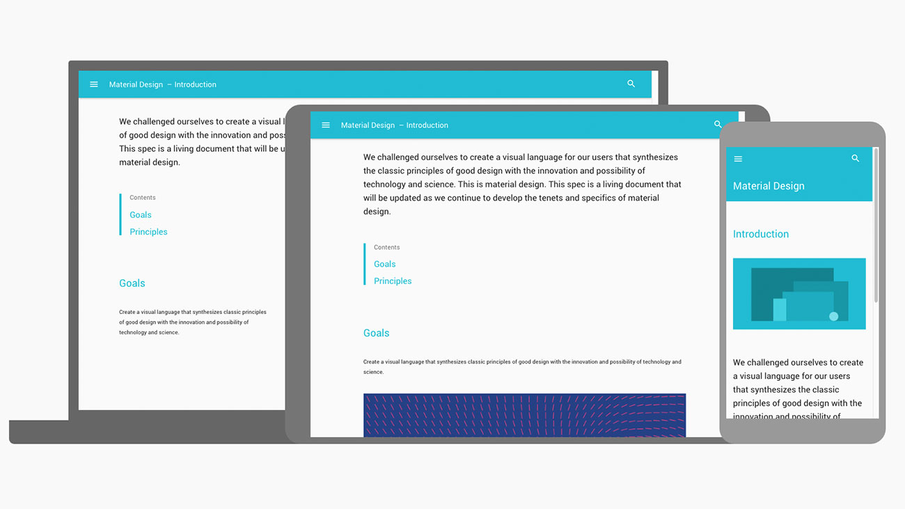
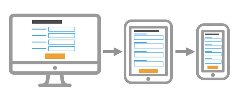
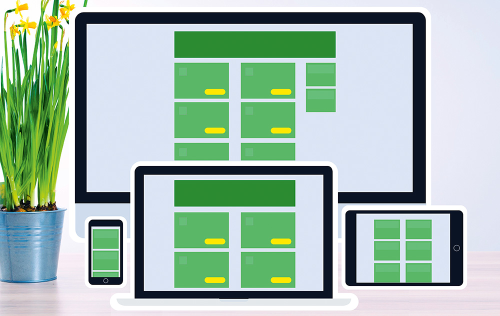
Responsive web design is no longer optional; sites have to be responsive these days. Thankfully RWD is easier than ever to implement as there are so many great tools to help you create and test your designs, and ensure you create the best user experience.
Here’s our roundup of some of the best resources that will guide you in making your websites work well and look great on any device. Want some more useful resources? Our guides to the best website builder and web hosting service are here to help, and we also have a selection of web design tips. If you’re concerned about storing files securely, you need these brilliant cloud storage options.
01. How to start thinking responsively
In this post on FreeCodeCamp, Kevin Powell makes the important point that responsive web design’s no longer a trend; it’s the way sites are expected to be built, and that means thinking responsively from the start. Here he demonstrates how to get into the responsive frame of mind, while building a fully responsive 3-page website.
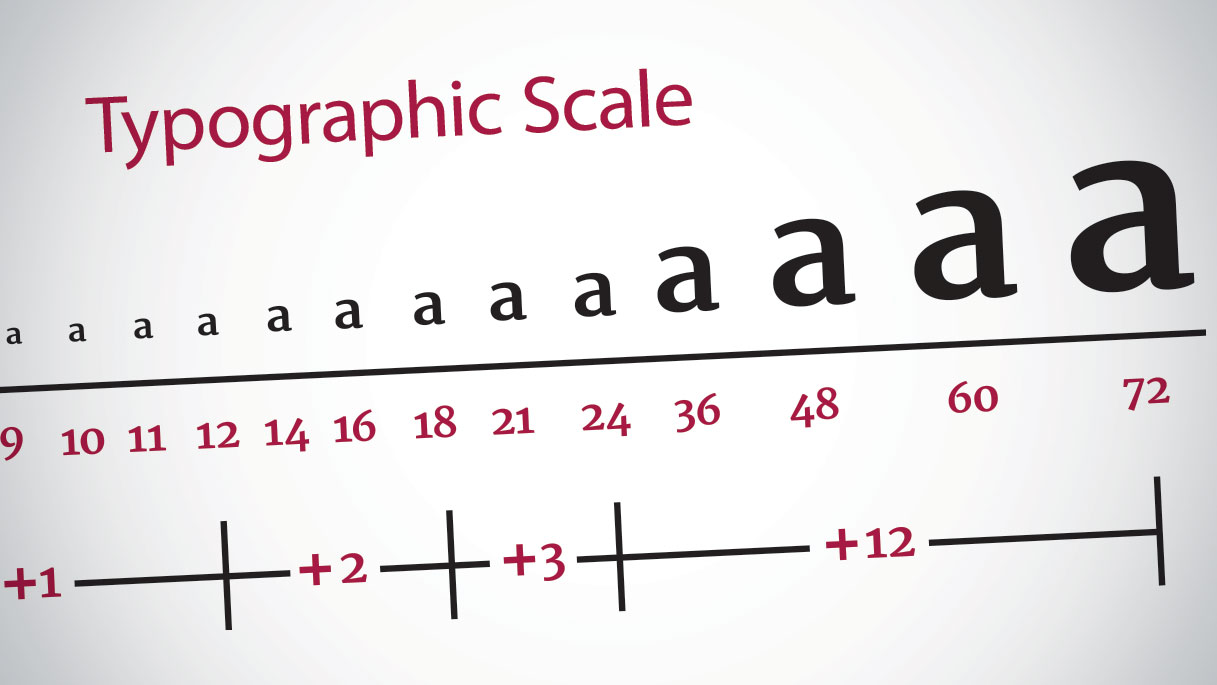
02. 9 responsive typography tips
Responsive web design, naturally enough, needs responsive typography to go with it. But what does that even mean, and how do you implement it? We asked seven leading web designers for their tips on creating elegant, legible text in every viewport.
03. The rules of responsive web typography
Responsive web typography is tough – you need to have both design chops and technical know-how. But however tricky it might be, getting it wrong isn’t an option, because typography is the cornerstone of web design. Follow these design principles and practical solutions to get it right.
04. Design a responsive site with em-based sizing

By using em units for font sizing, you can design components on the page that respond automatically should the font size change. Then, with a clever trick for a responsive font size, you can produce an entire page that adjusts dynamically based on the viewport width of the browser. Follow this tutorial to learn how to leverage the ‘relative’ behaviour of ems to create designs that are scalable and responsive.
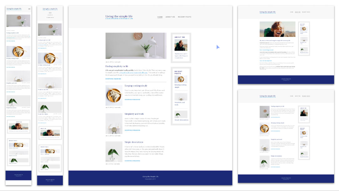
05. Priority guides: a content-first alternative to wireframes

Wireframes may be the most widely-used tool for designing websites, apps and other digital interfaces, but they’re not without their drawbacks, particularly when it comes to responsive design. Here Heleen van Nues and Lennart Overkamp introduce their preferred alternative to wireframes: priority guides, which contain content and elements for a mobile screen, sorted by hierarchy from top to bottom and without layout specifications.
06. The pro’s guide to responsive web design
Written by Justin Avery, curator of the Responsive Design Weekly newsletter, this guide from net magazine takes web pros through the basics up to the more advanced responsive web design techniques.
07. How to design responsive and device-agnostic forms
Forms are one of the most important elements in any digital product design, and whether you need a signup flow or a multi-view stepper, you need to design it so that’ll work effectively on mobile devices just as well as on the desktop. Here’s how to do it, complete with helpful tips on how to use Flexbox.
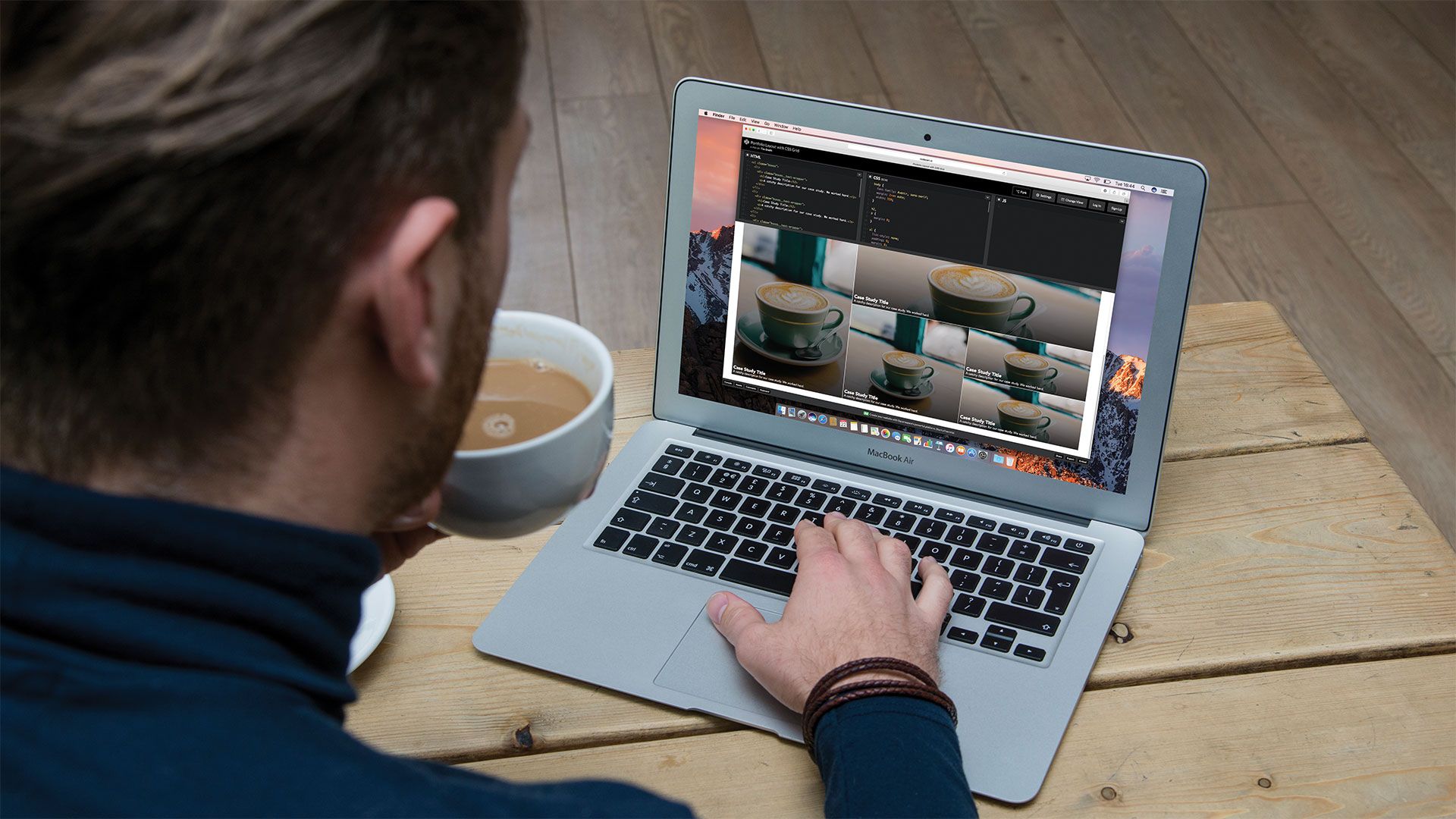
08. Create a responsive layout with CSS Grid
CSS Grid Layout is growing in browser support every day, and while it’s not a replacement for Flexbox or even for floats, when used in combination with them it’s a great way to create new and exciting responsive layouts. Follow this step-by-step guide to building a responsive portfolio site using Grid.
09. The web designer’s guide to Flexbox

Have you started using Flexbox yet? In this tutorial Wes Bos provides a comprehensive guide to the core concepts that will give you a solid understanding of everything you need to get to grips with this powerful tool.
10. Codrops Flexbox reference
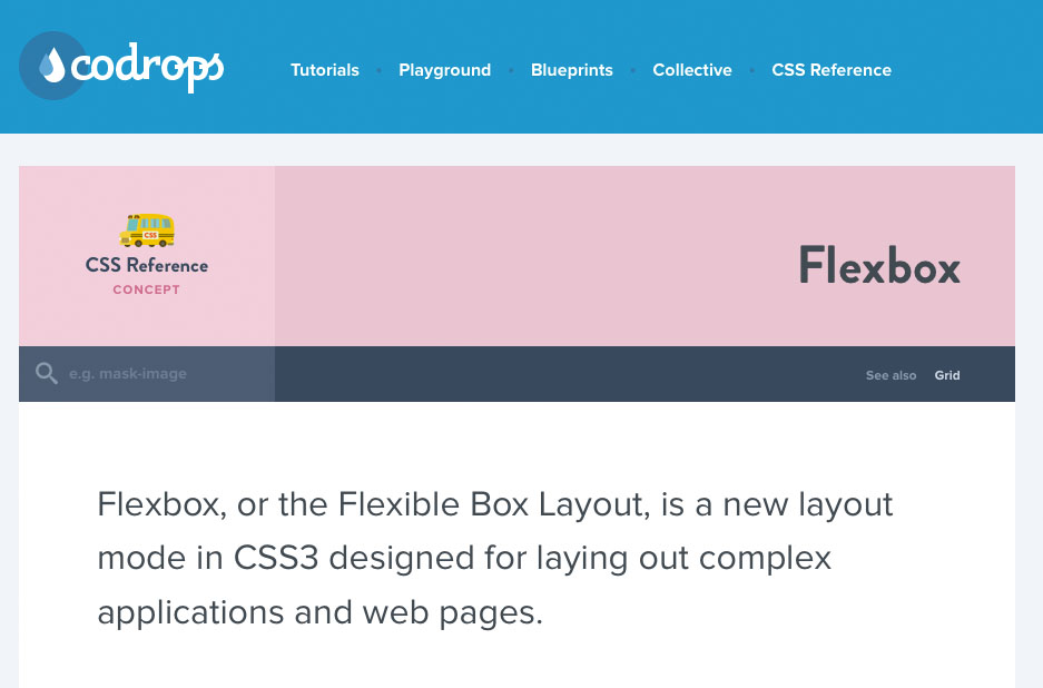
This complete guide to Flexbox is written by Sara Soueidan, an author who is renowned for her ability to explain concepts in a way that’s easy to follow without scrimping on detail. The Codrops guide is regularly updated so it’s a great resource to return to when you need it.
11. Stacks: Flexbox for Sketch
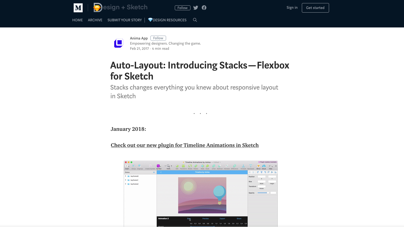
Stacks, part of the Auto Layout plugin, provide a way for you to use Flexbox technology within Sketch, without using CSS. This article explains how you can make use of this powerful technique for easy responsive design.
12. A crash course in technical RWD

Writing on the Treehouse blog, Jerry Cao has condensed a lot of useful information into a relatively short, readable article.
13. Create flexible layouts with Susy and Breakpoint

If you don’t want to use a framework to build your responsive site, these Sass extensions are a nice alternative, each with their own strengths. They’ll take care of the responsive maths for you so you can focus on design.
14. How to create responsive guides in Adobe XD
If you’re keen to try out Adobe Experience Design (XD), here’s a good tutorial to get you started. It includes a video demonstration that takes you through every click of the process.
15. CSS at BBC Sport
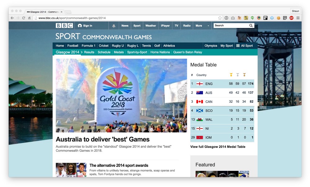
This isn’t a tutorial per se, but there’s a lot of learning here. In this post, the first of a two-part series, frontend developer Shaun Bent takes us on a detailed tour of how CSS is done at BBC Sport. They’ve managed to keep the CSS foundation of this massive site under 9kb, and it’s fascinating to see how that’s been done.
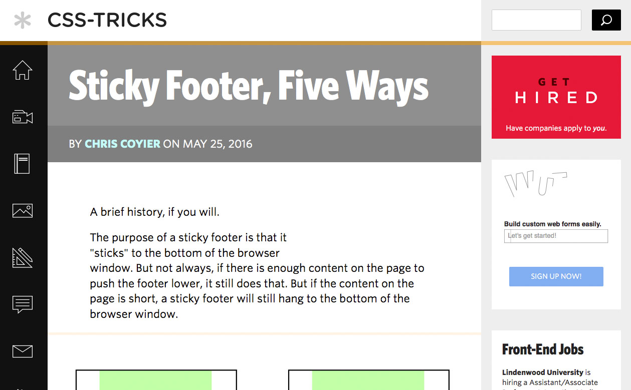
Sticky footer… that should be simple enough, right? Unfortunately not. It can be trickier than you might expect to get that footer in the right place on every device. Luckily Chris Coyier has put together five tricks that will help you to make it happen using calc(), Flexbox, negative margins and Grid.
17. Adapting to input
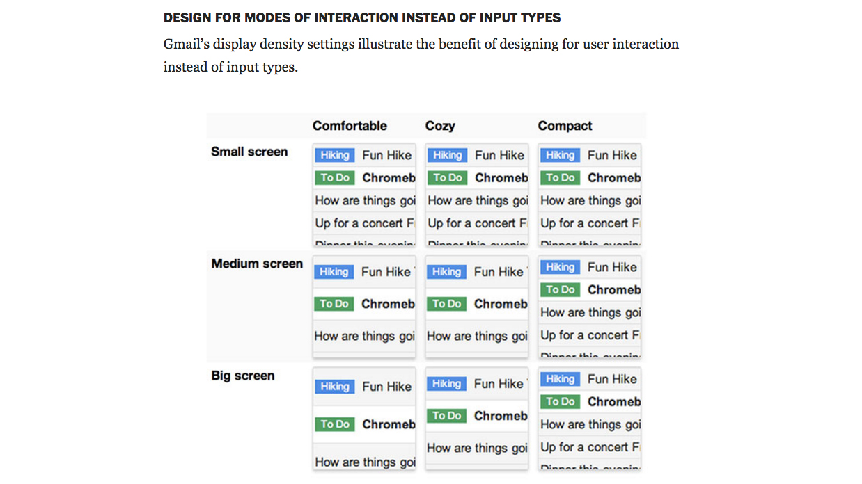
Responsive design isn’t just about making your page display properly on any device, you also have to make it function well – and that means it has to be good at accepting input in a world where desktops have touchscreens and phones have keyboards. This article by Jason Grigsby of Cloud Four has some sound advice.
18. Our best practices are killing mobile web performance
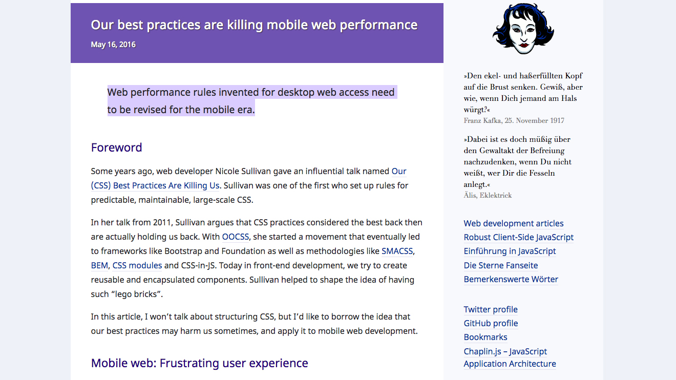
Applied without consideration, certain best practices that were conceived during the desktop era may have a detrimental effect on mobile web performance. This article will make you think more deeply about how you get your site to work well on mobile.
19. How to make responsive web apps with container queries
Learn how to transform a beautiful, complex web app – with components, states and interactions – across different dimensions and resolutions, using container querie.
Related articles: