
You may have blinked and missed it, but there’s been a bit of a revolution in resolution over the last few years. Once seen as an experimental and cutting-edge technology, 4K screens are now commonplace: in TV screens, computer monitors and even smartphones.
With 4K offering four times as many pixels per inch, web designers need to make sure their websites look as good as they can on the latest screens. Of course, if you’re already following the principles of responsive web design, that will get you most of the way to ensure your website looks good wherever it’s being viewed. But beyond that, here are four areas you particularly need to pay attention to in the 4K era…
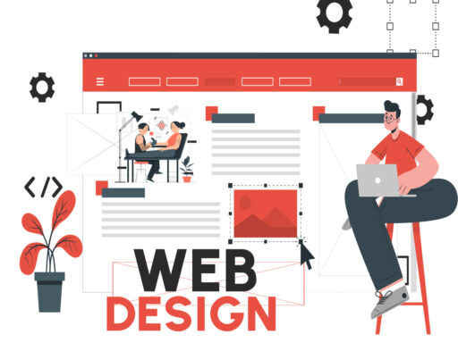
01. Use scalable graphics
For your website to look good on 4K screens, you need to use scalable rather than raster images wherever possible.
With raster formats (which include jpegs, GIFs and PNGs), each image contains a fixed number of pixels and so as they increase in size, they just get more pixellated and blurry. Scalable formats, known as SVG (scalable vector graphics), in contrast, are based on geometric shapes. This means that however big they get, they will remain clean and clear.
Of course, you still need to use raster formats for photographs. Which means you need to use media queries to serve high-res versions of your photos to 4K and 5K Retina screens, and much smaller, lower-res versions to mobile devices, to avoid killing your site’s performance on 3G and 4G connections. (If you’re working with a lot of images, it’s worth noting that Photoshop CC lets you export a single image in multiple sizes simultaneously.)
Logos, drawings, user interface tools, buttons and so forth, though, should always be created as SVGs. This can be done in software such as Adobe Illustrator, CorelDraw and Affinity Designer. To learn more about scalable graphics, read our 10 golden rules for responsive SVGs.
02. Consider larger displays
When thinking about what your website will look like in 4K, remember that higher resolutions are making bigger and bigger screens more popular.
So although we’ve only just got used to the idea of our sites being viewed on 1920×1080 monitors, we’re now having to think about what they’ll look like on displays on that are 2,560 pixels wide. Many websites can be difficult to read on these screens, where the text and content may look constricted and shrunk down, and an overabundance of whitespace.
This excellent article by Jon Yabkonski on CSS Tricks addresses the technical challenges these wider displays present, and suggests some solutions.
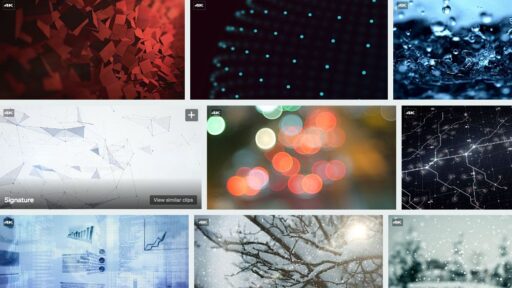
03. Use 4K video
Because our eyes naturally respond to movement in a way that still images can’t compete with, video is a popular tool for grabbing the attention of website visitors. But whether you’re adding a video header, video background or strategic video clips to your site, right now, you have to serve it in 4K to avoid looking clunky and old-fashioned on the latest devices.
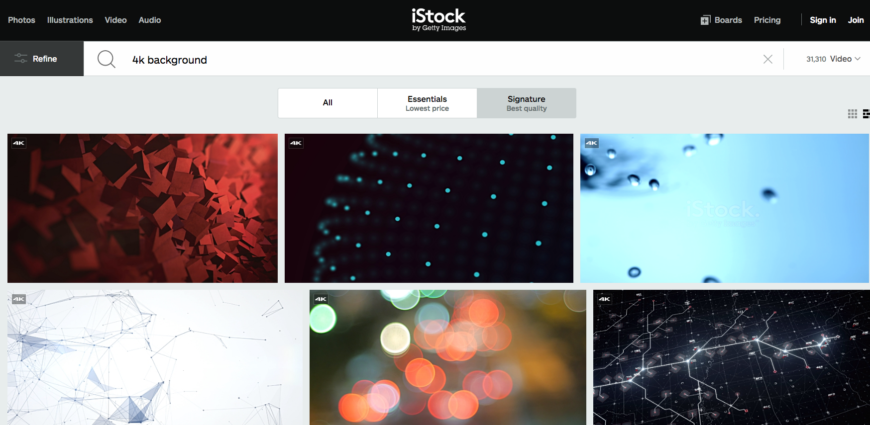
There are many cheap and easy ways to shoot 4K footage nowadays, with many of the latest stills cameras, POV sports cameras and smartphones offering 4K shooting capabilities. Alternatively, if you don’t have the time, or need something you couldn’t shoot yourself, such as drone footage, most stock libraries now have masses of 4K video content for you to download.
For more on using 4K video, check out What the new wave of 4K video means for designers.
04. Buy a 4K monitor
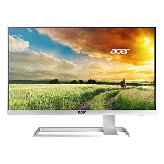
At the end of the day, the best way to be sure your websites will look good on a 4K monitor is – to state the obvious – to buy a 4K monitor. The good news is that it’s possible to get on for as little as £250, although as with everything, you get what you pay for.
You’ll find an up-to-date roundup of the latest monitors by our sister site TechRadar here, while if your work involves 3D, motion graphics and/or video editing, you may want to check out this roundup too.
Read more: