

In the last few years mobile design has exploded, but knowing what to do and where to start can be tricky. Mobile website design is not just a question of choosing between a mobile website or an app – there are a range of options in between and aspects to take into account. To help you out, we have gathered together 30 top tips on what to consider when defining your mobile strategy and designing for mobile.
Note that we are focusing on on mobile website design and, to a lesser extent, app design, but not responsive websites – take a look at our article on how to make an app and our roundup of responsive web design tutorials if that’s what you’re interested in. Also see our selection of CSS and JavaScript tutorials.
01. Think ahead – define your objective now and for the future

We’re in a time when technological advances happen quickly in mobile website design, and new players are constantly being introduced. Consider how the first iPad came in the summer of 2010 and the Apple Watch in 2015; it’s safe to assume that even just two years from now things will very different to today.
As much possible we need to build something which can be evolved a year or two from now rather than require a complete redesign. So define your immediate mobile website needs as well as your longer term ones and cosider the pros and cons of the value that doing an app brings vs investing in a site that works across devices.
02. Know your target audience and what they use
Knowing what type of device people are viewing your mobile website on is key for guiding the design process and your mobile website strategy. Though many people have smartphones, don’t assume that everyone does, or that they all have an iPhone or Android phone. Instead look into what devices your target audience actually are using with the help of analytics or research.
Other things to consider is how your target audience use their phone and for what as well as if they have a reliable internet connection. The latter is particularly important if, for example, your users will fill in forms on their mobile devices.
03. Understand mobile website usage and behaviour patterns

There are a range of misconceptions regarding mobile website usage that can lead to misleading design decisions. One of the most common ones are how mobile users are always rushed and on the go, or that we’re only interested in certain things when we use our mobile phones.
In fact a big portion of our mobile website usage happens when we have time to kill or when we’re sat at home in the sofa and that impacts how we should approach things.
It’s better to base your design decisions on the theory that we’re increasingly using our phones for the same tasks as we do on desktop, as this is actually what’s already happening. But as much possible do research into the specifics for your target audience to understand what’s true for them.
04. Understanding tasks and context
In the early days of mobile usage there was a stronger relationship between tasks and context. Limitations with devices as well as how we experienced the internet on them meant that the tasks we carried out were quite limited. If someone accessed our site on a mobile device we could assume they were on the go and after something specific.
Today mobile devices are used anywhere and everywhere and increasingly for the same tasks as a desktop. Though context is still an important consideration, it’s in the form of how our surroundings impact our usage rather than that the context we’re in equals a set number of tasks that we want to carry out.
05. Try to avoid bespoke mobile site
So how do you decided what to do with your mobile website? Limitations with current technical solutions like a CMS may make building a bespoke mobile website necessary. But if possible try to avoid building separate mobile sites. In the long run these will be more costly and time consuming to maintain as it means doing bespoke ones for different devices.
Building something which works on as many devices as possible will provide you with the best setup for focusing your resources and budget on the content rather than maintenance.
06. Keep core content the same

As users increasingly are using their mobile devices for the same tasks as on desktops and due to this expect an equal and continuous journey across devices, there is a strong argument that your mobile website should be a reflection of your desktop version.
People do click the ‘desktop version’ link, particularly when served with a very limited mobile website, or a site that is substantially different structurally or visually to what they are used to. So try to keep the core content the same and keep in mind how the user will move from one device to another and what that should mean for their experience.
07. Optimise for mobile
Just because you keep the core content the same doesn’t mean that you shouldn’t or can’t optimise your mobile website. On the contrary you should optimise both display of content, interactions where appropriate to make them better for touch and look at using built in device capabilities.
Mobile provides great opportunities for creating even better and more tailored experiences than on desktop and these can still be achieved even if you don’t build a bespoke mobile website or app.
08. Look at entry points as a guide for whether to do an app or not

Apps are great for more focused and personal experiences and if you’re considering supplementing your offering with an app using analytics and looking at entry points can be a first guide. If the majority of your users arrive via direct traffic this could indicate that they bookmark your URL and that an app icon on the home screen would be of value. If most of your traffic comes via shared links an app alone won’t cut it as people need to be able to get to your content even if they haven’t installed your app.
09. Use analytics to define what devices to focus on
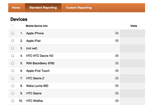
Consulting analytics is also great for defining what devices to focus on in terms of operating system, version, or screen size. For example, in Google analytics you can see a breakdown of the devices that are being used, the divide between different operating systems as well as what versions of each operating system that is being used.
10. Consider the different types of apps
If you have identified that you need an app look into what type of app that is right for you. Native apps like Instagram are built specifically for each operating system. Due to that they often provide the most device optimised experience but it does mean maintaining bespoke code bases.
An alternative is hybrid apps like Facebook that are based around HTML5 and JavaScript, using a wrapper to provide native capabilities. This means fewer versions to maintain but can be timely to get the functionality to be app like. What to choose depends amongst other things on your objectives, budget and how often you need to update your content.
11. Adhere to UI guidelines and patterns
Every operating system has a set of UI and interaction principles that their users are used to. If you create an Android app don’t just take your iOS app design and use it as is but optimise and recognise that each operating system is different. Learning what makes them different and adhering to the guiding principles will make your app easier to use.
12. Consider backwards compatibility and fragmentation
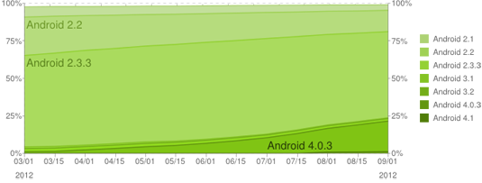
When it comes to doing apps it’s not as simple as iOS and Android. Each operating system has different versions and not every user will be on the latest one. Adoption rates of new versions varies and whilst it’s fairly rapid for iOS it’s slower and as a result more fragmented for Android. Make sure you don’t just design your mobile website for the latest versions but that the versions that your target audiences will primarily be on are covered.
13. Define your grid and breakpoints
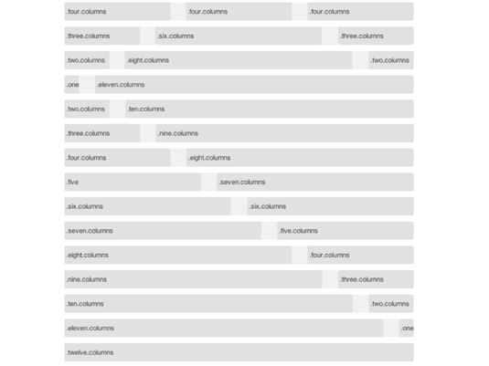
When it comes to responsive design, defining your grid and breakpoints is the backbone of your mobile website design. There are a number of tools to help you define both the number of columns, their width and the gutters as well as providing guidance for how these will work on mobile websites and smaller screens. In some cases a fixed approach where the width remains the same is more appropriate. In some a fluid approach or a combination of the two.
But the grid and your breakpoints, i.e. the different screen resolutions that change the display of content from one layout to the next, is your trusted friend when it comes to responsive and making your site modular.
14. Mobile or desktop first – where do you start
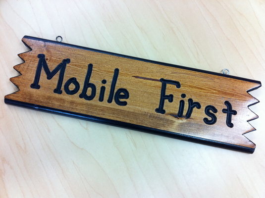
Designing for mobile first is still a hot topic. Some people are more comfortable with it. Others less so. As with everything there is seldom a right or wrong approach.
The key is to focus on the content and having smaller screens in mind, but whether that is done with sketches for mobile being made along the way whilst the more detailed definitions are done for desktop first doesn’t really matter. As long as you consider your content, why it’s there and how it should behave across devices. Start where you feel comfortable but experiment with both.
15. Define your content stacking strategy
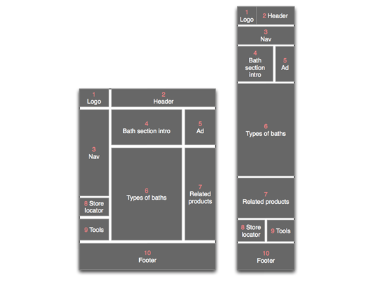
Unless you define how the different content modules in your columns are going to behave the modules in the left column will be placed at the top as you move to a smaller screen, followed by the middle column modules below and lastly the right column at the bottom. This seldom equates to the order of importance of the individual content modules.
To ensure your content is displayed properly from desktop to mobile or vice versa you need to define how the content modules are going to stack and reorder themselves. Use a simple number approach to start with, sketch out how the display of the content would change and take it to the rest of the team to work through. Get development to prototype it and do further definition where needed.
16. Don’t forget the navigation
An often overlooked area which is starting to get more attention when it comes to responsive design is the navigation. Brad Frost has written some excellent posts on the matter outlining different options as well as pros and cons with each. Read them and define how navigation is going to work on your mobile website, rather than leave it up to development to define.
17. Don’t be afraid to challenge what’s already out there

The web is full of great pattern libraries and tutorials. Learn from them and take inspiration but don’t be afraid to come up with something new or challenge what is already out there. Established patterns are great but pushing boundaries is what brings us forward and in the world of mobile things are moving fast.
18. Not every page/screen needs a wireframe/design
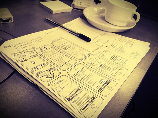
It’s easy to get trapped in that everything needs to be defined. But every page or view for every screen size or orientation does not need a wireframe or design. Use analytics as a guide for what to focus on, work closely with the development and the design team and find a way and level of definition that works best for you and your project. But try to avoid e.g. doing wireframes for each main screen size and orientation. A lot of that can be handled with a master set and sketches for the rest.
19. Work collaboratively and closely across disciplines

To get the best end result when it comes to mobile design, and design in general, there should be close collaboration between the different disciplines. Many problem areas won’t be noticed until you wireframes turns into designs and designs into build and the more you work together the sooner you will identify and find solutions to them.
20. Prototype, test, and iterate

The most important things when it comes to designing for mobile is to prototype and iterate as you go. Work closely with the development team to see if what is being proposed actually works when it’s built and to identify situations that needs more detailed looking into. And get something together that you can test with your prospective users and get actual feedback on. That in the end is what matters.
21. Deliver content quickly
The best mobile sites are elegant and clean. Try to understand what people visiting a mobile phone website will actually expect to see – ask clients what’s really important to them and consider what information their users will want to access quickly, such as reservation information, menus and location maps on a restaurant website.
22. Limited layers aid navigation
Try to keep to a maximum of three levels of navigation through a mobile site – some people aim for just two. Mobile users want to get information quickly, so they won’t tap here, there and everywhere just to find what they’re looking for.
23. Design from the user’s viewpoint

Try to learn to use a device from a user’s point of view. Test your design on that device and ask your clients to test it too, so you can see if there’s any information that shouldn’t be there or if anything’s missing. User testing is always really important as well.
24. Choose the right web font
While you should try to avoid using serif fonts unless they’re very sharp and easy to read, mobiles have advanced enough that you can be more creative with type and you can embed fonts on a mobile site. You still need to keep things as simple as possible for users, though. Also read our article on responsive typography tips.
25. Don’t get hung up on different devices
While you do need to be mindful of the fact that not everyone is using the same device – for example, not all smartphones have touchscreens – the technology used on different mobile devices is fairly similar. So remember that not everyone has the same screen resolution or input, but don’t get too hung up about it. If your content is worth accessing, people will want to access it, however the particular device interprets your styling.
26. Test, test, test
There are so many different platforms out there that it’s practically impossible to test on every possible combination of smartphone and operating system; new Android devices ship almost weekly, not to mention Windows Mobile, iOS, Blackberry OS and Cyanogen OS. It is important to test across a cross-section of devices, however, and you should aim to make this an iterative, ongoing process. There’s nothing worse than designing against iOS alone, then discovering at the end of your build that Android devices won’t render your page as intended.
27. Consider battery life
It might sound counter-intuitive to have to worry about battery life when you’re designing a website for mobile, but your users will thank you for being considerate. This is an issue web designers need to be aware of because smartphones and tablets have limited-size batteries, and powerful processors. The more you work the processor, the more the battery will drain. This is especially true when you’re using HTML5 features such as geo-locational positioning, or rendering complex canvas animations, so try to use these tools sparingly.
28. Accept and embrace the limitations
It’s tempting to try to cram every last bit of functionality into a mobile-orientated website, but you need to accept that some things are better suited to desktop machines than portable devices. Conversely, mobile devices are far better at some things than desktops. Location-aware content, for example, is an ideal application for mobile, but rendering webGL is (currently) best left to the desktop.
29. Minimise text input
On most phones and tablets it’s perfectly possible to type out a few sentences or paragraphs with relative ease, but it’s not exactly a fun experience. It’s also a pretty interruptive process on modern touch-screen devices as the virtual keyboard pops up over the web content. To reduce user frustration, aim to minimise the amount of text input you require in web forms, and where it’s really necessary make sure that you consider the practicalities: nobody is likely to type a 2000 word essay into Safari on an iPhone!
30. Love the pace of change
One of the best things about the current lifecycle of features on smartphones is the sheer speed at which the platforms are developing. Techniques that didn’t work just six or 12 months ago are now perfectly feasible. The downside to this is that code you work on today isn’t guaranteed to still work in a year, especially if you’re using cutting-edge technologies. Make sure your client understands this.
Contributors: Dean Evans, Anna Dahlström and Sam Hampton-Smith
This is an updated version of an article previously posted on Creative Bloq.