

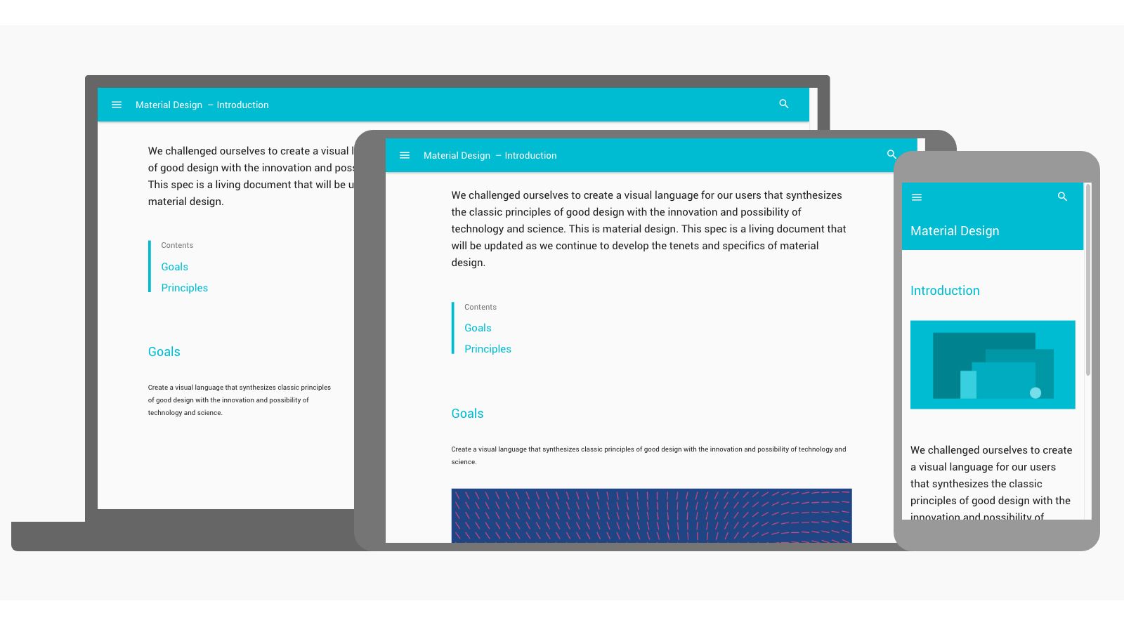
It stands to reason that responsive web design requires responsive typography to suit. But what does that actually mean, and how do you implement it? Font size, spacing and layout should work together to create an elegant, legible text setting in each viewport. But how? We asked seven leading web designers.
For a more in-depth explanation, take a look at our article on the rules of responsive web typography.
01. Size your body text appropriately

“Use a scale for different screen sizes,” emphasises UX strategist Jason Pamental, author of Responsive Web Typography. “Get that right and everything else will flow from there.” So how do you get it right?
UX designer Clarissa Peterson, author of Learning Responsive Web Design, suggests starting with the browser’s default font scaling. “Set your base font size to 100%, and each browser will make that a font size most users will be able to easily read on that device.”
Typically, 100% is the equivalent of 16px. On desktop, that may look surprisingly big, but most of us have trouble reading smaller text once we reach middle age – why not make it easy? “If the text feels too big, that likely just means you need to adjust the scale of everything else,” says Peterson. We’ll come back to that thought.
02. Consider the reader
Viewports differ in more than physical or pixel dimensions. Think about how the user interacts with the display.
Off the desktop, there’s less space to play with, but the user is closer to the screen. “Your typography should scale with regard to reading,” advises art director Brian Hoff. “Generally, I scale my fonts down when going from desktop to mobile. People tend to hold their phones closer to their face. Think about how people will consume the content and adjust the typography accordingly.”
“We should be similarly cognisant of how we treat type on larger screens, like televisions and console gaming systems, which we view from a distance, but may have relatively low resolution,” says Aaron Gustafson, web standards advocate at Microsoft and author of Adaptive Web Design.
“In situations like that, it may make sense to render type – and even adjust the layout – using vw units, which are proportional to the width of the viewport.”
03. Watch your measure
The width of a body text block, or ‘measure’, affects how comfortable it is to read. “When you have viewports that can grow (or shrink) indefinitely, the length of a line can become uncomfortably long (or short),” notes designer Elliot Jay Stocks on his blog. “It’s a mistake a I see a lot of people make.”
A guideline of 45 to 75 characters per line is often quoted from Robert Bringhurst’s The Elements of Typographic Style. Studies have found longer lines, up to 95 characters, are read faster on screen, but it’s not clear if that means readers enjoy reading more or understand better. There are too many variables to draw firm conclusions, so it makes sense to err on the side of moderation.
If you’re designing mobile-first, you’ll tend towards a short measure to avoid text getting too small. On desktop, you may want to let lines get longer in bigger windows. A max-width declaration can avoid this getting out of hand, but shouldn’t be necessary if you progressively increase padding.
You can also balance font size against measure to control the number of characters per line. Here’s a CSS media query example from Stocks:
@media screen and (min-width:1200px) {
    body { font-size:110%; } /* Increase the font size */
}
@media screen and (min-width:1400px) {
    html { padding:0 15%; } /* Reduce the container width */
}
@media screen and (min-width:1600px) {
    body { font-size:125%; } /* Increase the font size */
}
@media screen and (min-width:1800px) {
    html { padding:0 20%; } /* Reduce the container width */
}
04. Adjust line spacing
Line height, traditionally known as ‘leading’, is often neglected. What’s just enough to keep lines distinct at one scale or measure may be too much at another, losing the reader’s eye as they try to move from one line to the next. “No-one enjoys reading between the lines,” says Hoff.
“Unpleasant gaps” can be avoided, suggests Stocks, with “some very clever maths to make sure your values are directly proportional to your font size” – or “just do it by feel”. “Optimise line-heights at different break points,” recommends web designer Marko Dugonjić.
05. Use visual variation other than size

In an expansive desktop design, you might make headings several times bigger than body text for clarity and drama. On a mobile screen, oversized headings just push body text down, breaking continuity and demanding excessive scrolling.
Dugonjić suggests alternative ways of achieving visual hierarchy. “On small screens, format subheads using style variations – uppercase, small caps, italic, bold – at the same font size. Indent paragraphs and use white space to separate sections.”
06. Choose fonts wisely
Working at multiple scales demands even more of your typefaces. Besides ensuring any web fonts render well on all platforms and have sufficient Unicode scope for your site’s planned internationalisations, it’s worth looking for greater typographical flexibility.
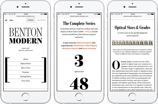
Multiple weights, small caps and condensed variants will give you options for better results in different viewports, suggests Dugonjić, whose Benton Modern sample site demonstrates responsive type pushed to its limits. Just don’t go mad, warns Pamental. “Choose fonts sparingly. Don’t load too much, and make sure to test real type in the browser on various platforms” for appearance, page weight and render speed.
Web Font Loader, co-developed by Google and Typekit, can help you control the loading experience. Don’t overlook fallback for when webfonts fail. Anna Yeaman at Style Campaign, a creative agency specialising in responsive email design, recommends testing web-safe fallback fonts and tweaking media queries to minimise reflow.
07. Use a type test rig
Juggling type libraries and CSS isn’t conducive to creative flow. Dugonjić’s Typetester is now a fully-fledged WYSIWYG web typography editor. You can use it to test, compare and design with over 2800 web fonts from Adobe Edge, Adobe Typekit and Google Fonts. Then export your designs as fully responsive HTML and CSS snippets.
08. Set type in context
Layout can break the most meticulous typography. Remember “the white space around the words – where you eye can rest – and use of imagery,” says Gustafson. This is where the responsive designer needs to be particularly alert. “On a narrow screen, images might reduce readability. A floated image could wrap long words below it rather than next to it.”
Width and padding values will need to vary with viewport size to keep layouts feeling visually ‘right’ as well as managing line length. When setting break points between multi- and single-column layouts, a wider single column with horizontal space may be more comfortable on medium-size screens.
09. Learn from others

A blank canvas needn’t be your springboard. Back in 2015, Yeaman surveyed 50 responsive emails to compare the choices other designers had made in typeface, size, spacing and other factors, and found the results instructive. Whatever the nature of your project, there’ll be exemplars in its field. The consensus isn’t always optimal, but it’s not a bad place to start.
Read more: