

Ships and vehicles are a fascinating area of concept art because they can communicate so much about the world where a game or movie is set. Sometimes vehicle designs can feel cold or uninspired, but I have some favourite techniques for ensuring designs have character and really bring a world to life.
Below, I’ll share my 10 pro tips for creating characterful machines in your work. Need to upgrade your software? See our roundups of the best digital art software and the best 3D modelling software.

Based in California, John is a specialist in vehicle design, and is also an author and concept art educator. He has a wide-ranging background working within the automotive, film, toy and video games industries.
10 top tips for vehicle and ship design in concept art
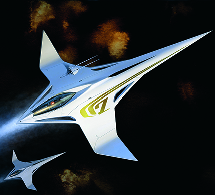
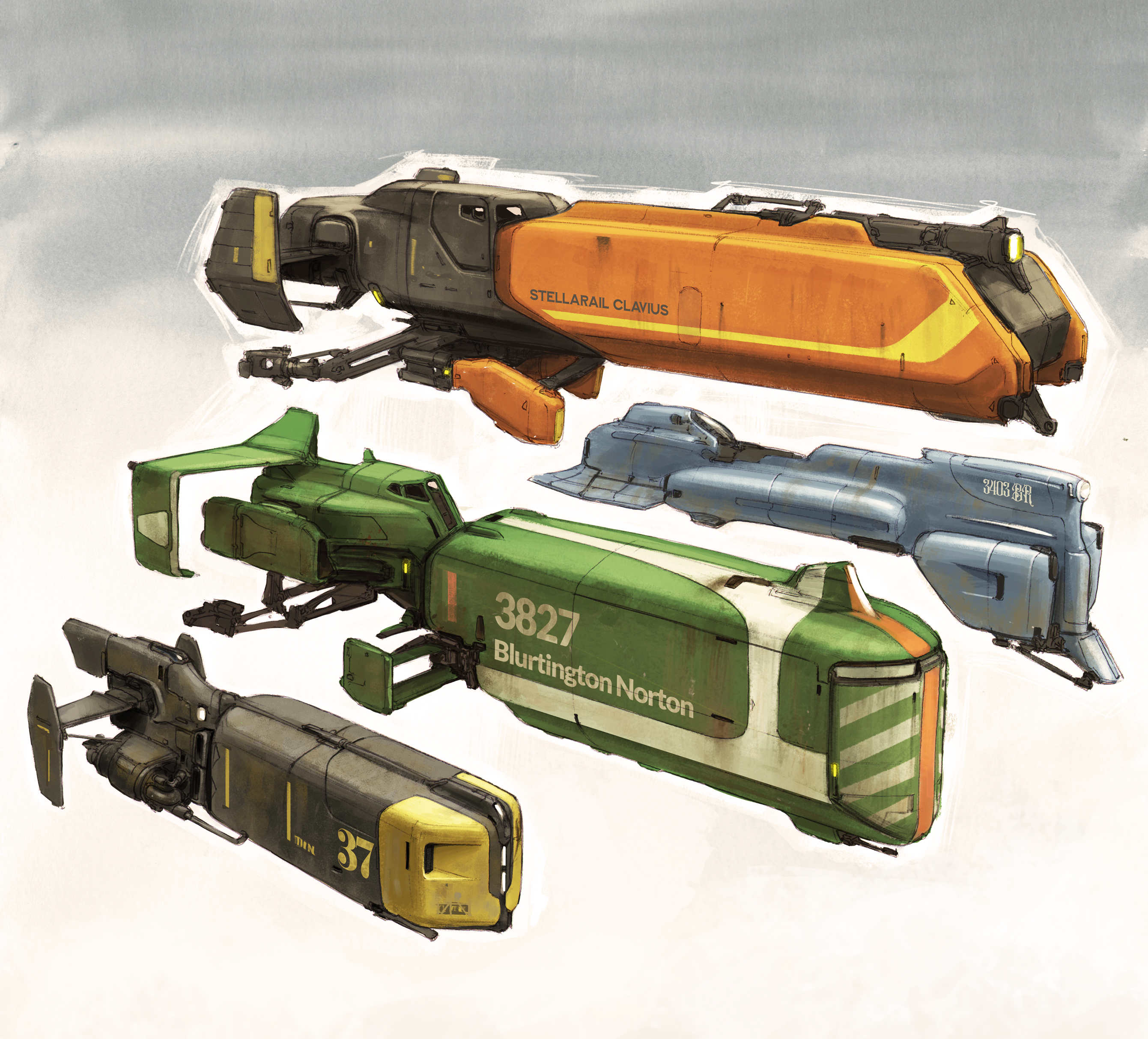
01. Expressive shapes
(Image: © John A. Frye)
Dynamic vehicle design isn’t static. Shift the balance of the cabin, overhangs and angle the body’s form to add a sense of movement to your design.
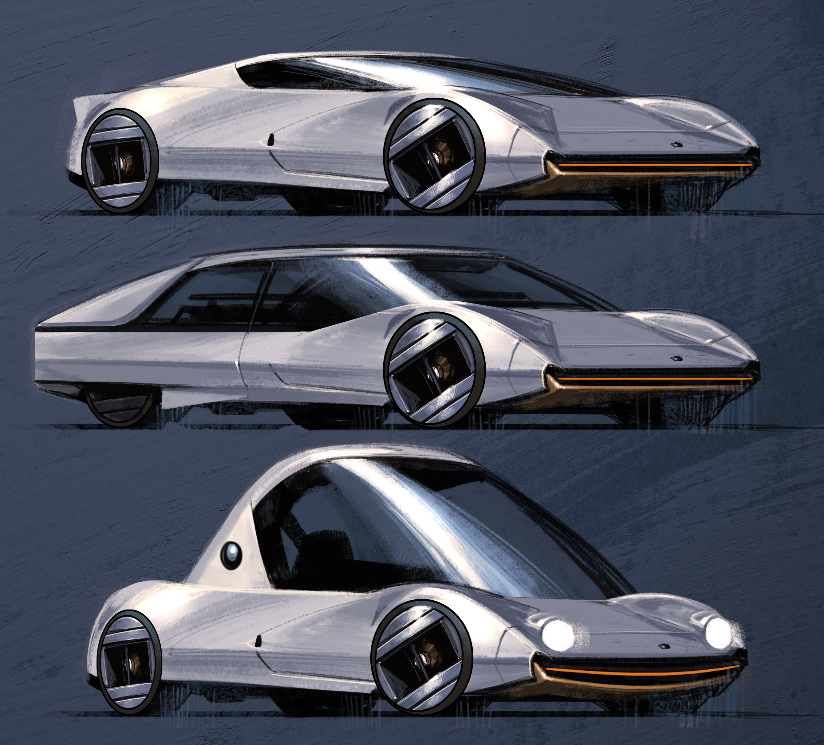
02. Eye-catching imbalances
(Image: © John A. Frye)
Distinctive asymmetric elements break up a predictable mirror image and grab attention. Off-axis elements could be functional or aesthetic.
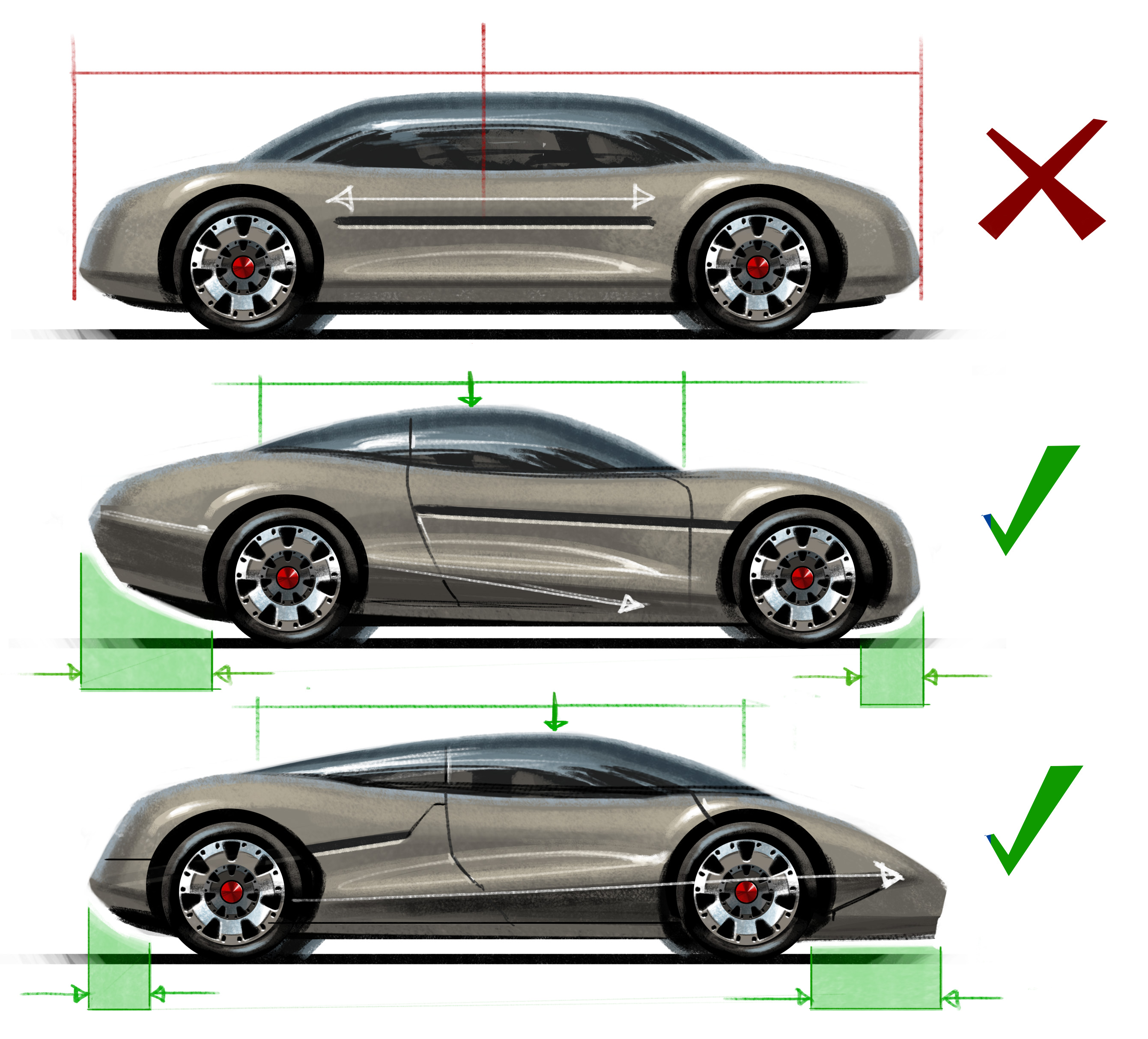
03. Body-to-glass ratio
(Image: © John A. Frye)
A taller upper cabin can appear stately and composed, juvenile or cute. Shorter cabins imply sportiness and aggression.
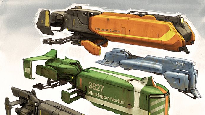
04. Purpose and function
(Image: © John A. Frye)
Every vehicle should have a main purpose. Defining what a vehicle does will guide the form, mass and detail to communicate its functional character to the viewer.
05. Humanise the design
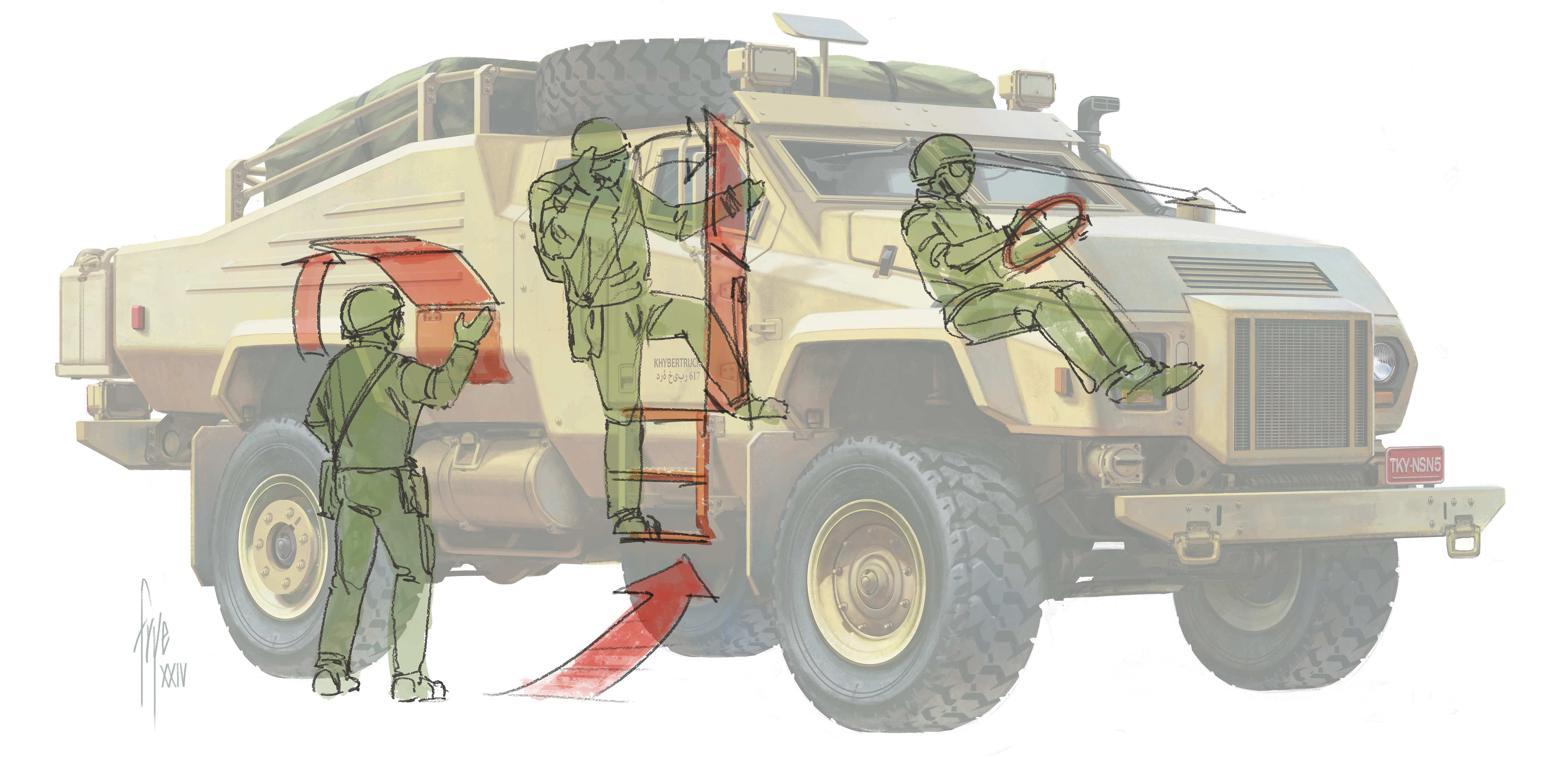
(Image: © John A. Frye)
Complete the vehicle from a human perspective. Walk up to it, climb in, sit down and look out. The detail and design will follow function.
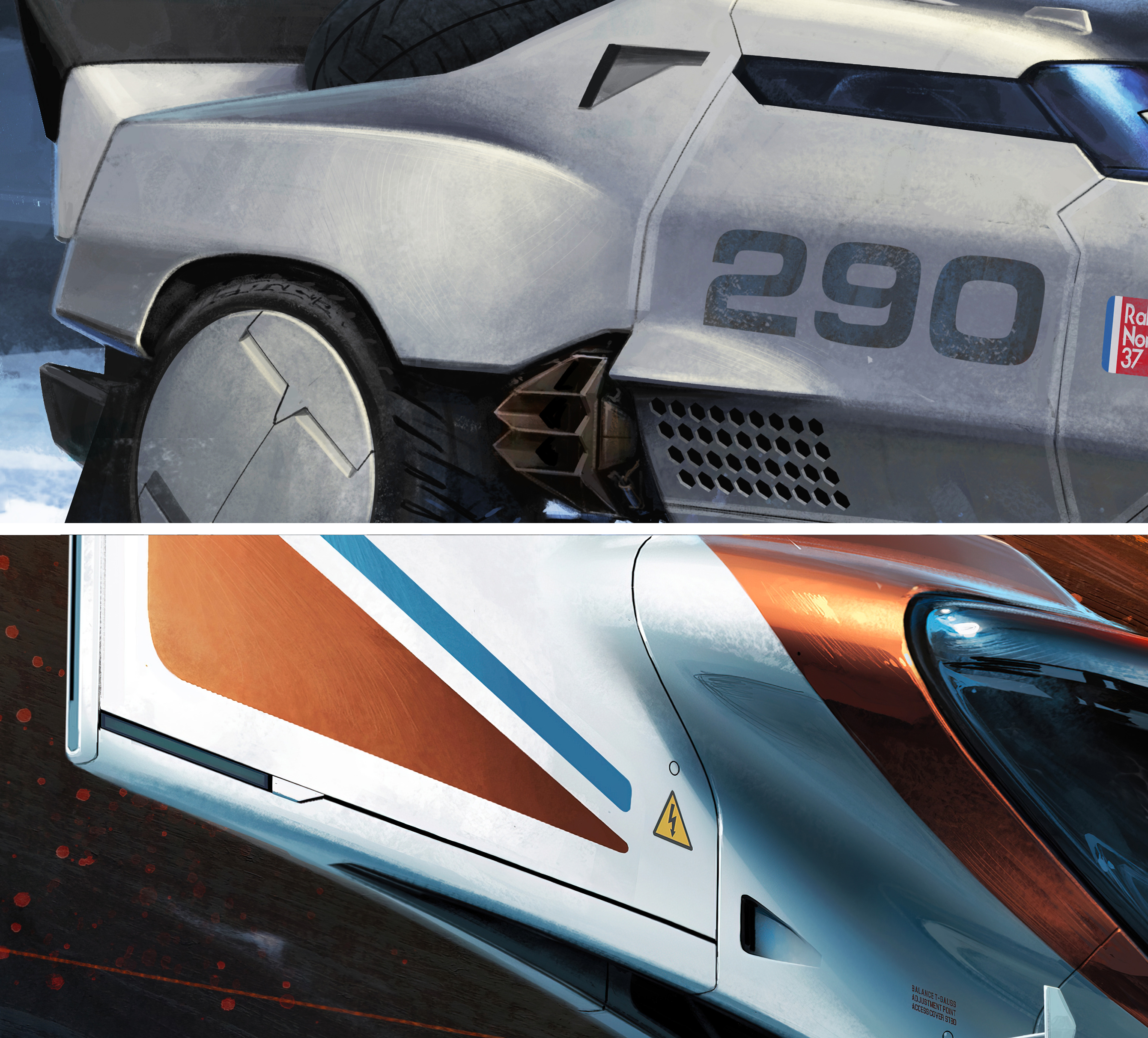
06. Paint picks
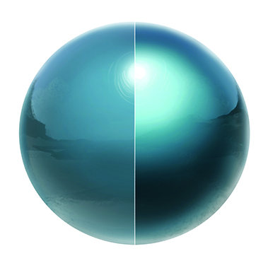
(Image: © John A. Frye)
Metallic paint (right) shows more form than solid glossy paint (left). Metallic paint adds tiny flakes that scatter the light to make specular areas brighter and shaded areas darker.
07. Simple, realistic glass
(Image: © John A. Frye)
Initially render glass as a tinted transparent film, then add opaque light values as glare where sunlight and bright sky reflects.
08. Shades of metal
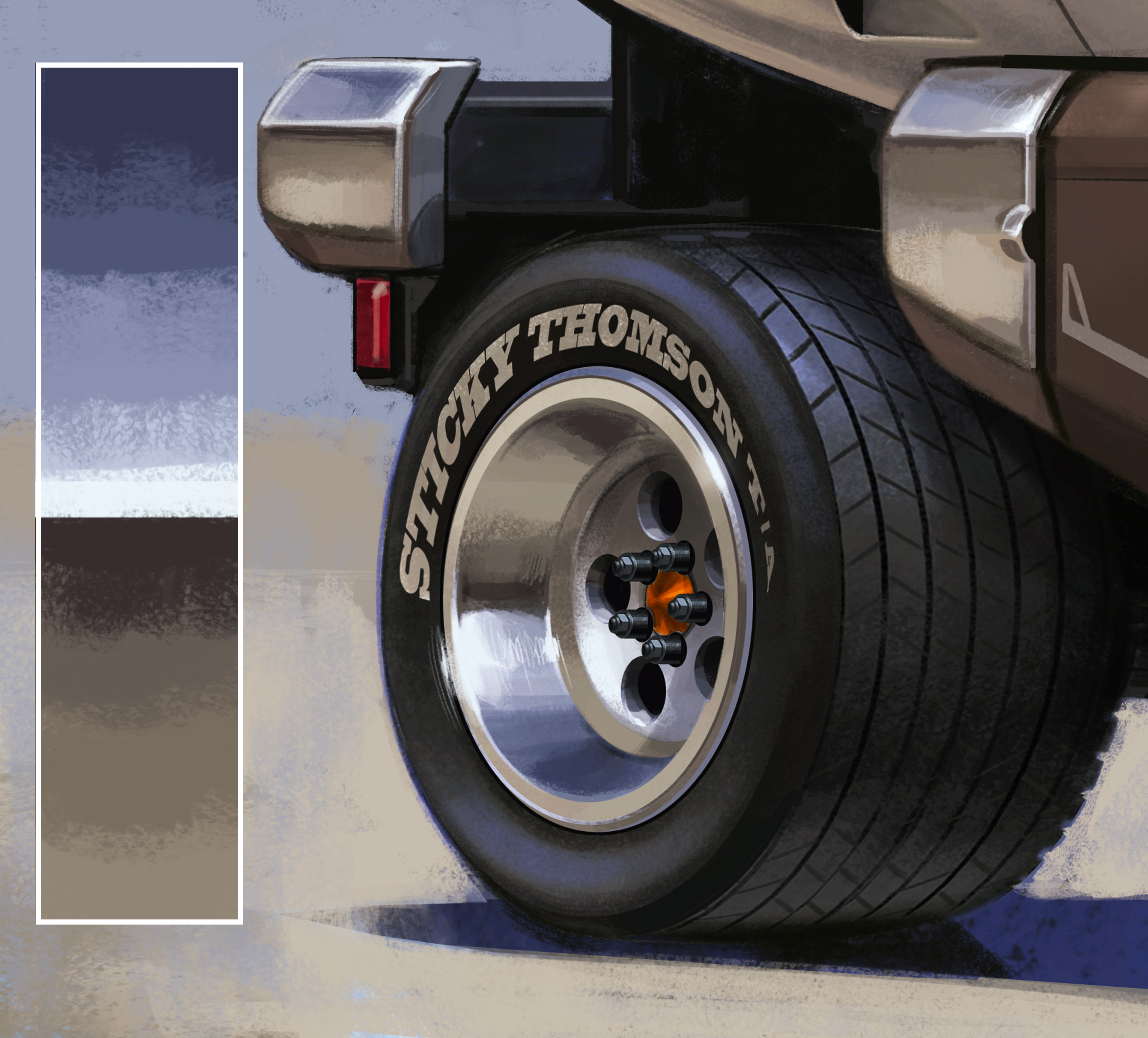
(Image: © John A. Frye)
Neutral-toned metal will accurately reflect the sky and ground colour. Avoid a cartoonish look by using desaturated blues and muddier, warmer ground tones.
09. Control your edges
(Image: © John A. Frye)
Hard-surface illustration relies on clean edges, so sharpen the perimeters of manufactured surfaces with hard-edged brushes.
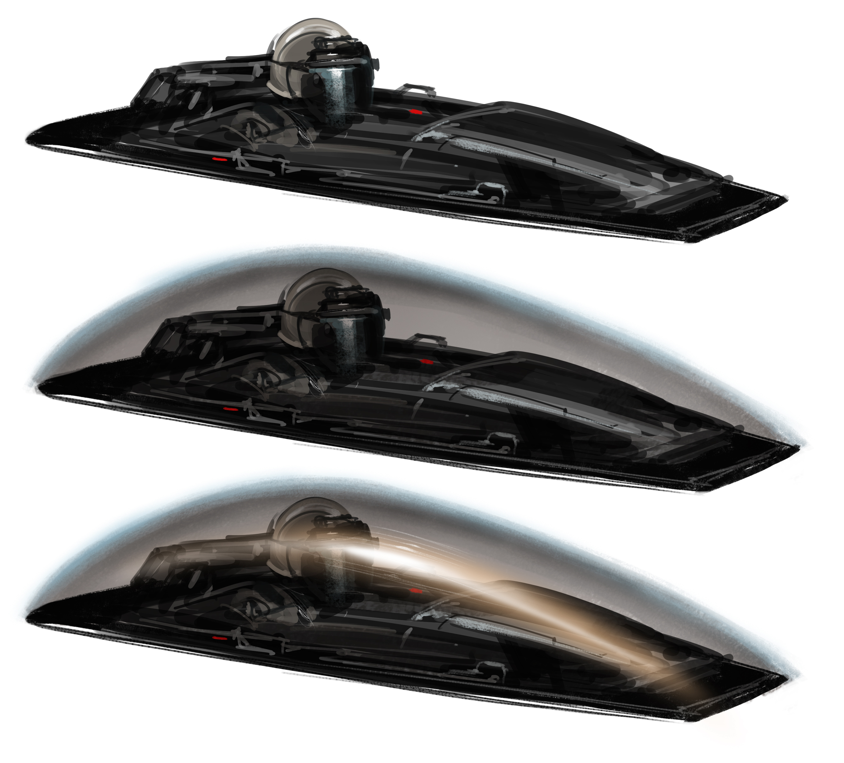
10. Stretched light

(Image: © John A. Frye)
Panels have radiused edges for durability, which catch and stretch highlights. That light spot can bloom, bleeding over the dark gaps between your panels.
Get more tutorials in ImagineFX
This content originally appeared in ImagineFX magazine, the world’s leading digital art and fantasy art magazine. ImagineFX is on sale in the UK, Europe, United States, Canada, Australia and more. Limited numbers of ImagineFX print editions are available for delivery from our online store (the shipping costs are included in all prices).