
Smartphones are ubiquitous and are rapidly becoming the device of choice for consumers who want to shop online. According to HubSpot’s Shopping Trends Report 2024, 62 percent of consumers prefer shopping on their smartphones over desktops, laptops or tablets. Unfortunately, some e-commerce merchants haven’t gotten the message and adapted their online stores to suit small screens. If a consumer faces an unintelligible and difficult small-screen shopping experience, they’ll take their business elsewhere.
Consumers expect a frictionless e-commerce experience on desktop and mobile platforms — and some e-tailers are getting it right. We’ll showcase seven mobile-friendly e-commerce websites to help online businesses understand how to create a great mobile user experience (UX).
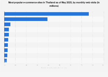
7 great mobile-friendly e-commerce websites
Here are seven examples of e-commerce websites that have mastered the mobile experience. We evaluated each site on multiple smartphones and tablets to confirm seamless mobile performance. If you have an e-commerce store or are about to start selling online, these are excellent models to emulate.
Peter Malick, founder and CEO of business development specialist InboundAV, reviewed the list and found that it aligned with the best qualities of mobile-friendly stores. “Each e-commerce platform excels by addressing specific user needs,” Malick explained. “Etsy creates a community for unique, handmade items, while Nike blends shopping with storytelling. Amazon dominates with convenience and vast inventory, while sites like Lush and Threadless engage users with transparency and creativity.”
1. Etsy

The easy-to-navigate Etsy mobile homepage. Image source: Etsy
Etsy is a popular e-commerce site where third-party sellers — often artisans — offer their unique creations directly to the public. Etsy has a popular mobile app, but its mobile website is also user-friendly and well-designed.
The homepage features thumbnails that directly link to the site’s most popular categories. Listing all product categories is challenging on a phone because of the limited screen size. However, Etsy effectively navigates this limitation with its smart navigation menu. As soon as you select the search bar at the top and start typing, you’re immediately presented with product categories. For example, type in “H,” and you get a complete list, from “home décor” to “hoodie.”
“Etsy excels in mobile e-commerce with its intuitive search and filter options tailored for small screens,” Lorenzana explained. “The streamlined user experience enables shoppers to navigate thousands of products quickly while clear product images and succinct descriptions ensure that even detailed items are easy to assess.”
Riley Williams, company director at The Wolf Of The Web, agreed that Etsy’s mobile site is excellent. “It’s easy to use, visually pleasing and offers options right at your fingertips without the need to keep scrolling,” Williams noted. “It also offers customer reviews so potential buyers can get an understanding of what their expectations should be.”
Takeaway: Keep it simple. Shoppers prefer a straightforward design that makes it easy to quickly find what they want.
2. Express
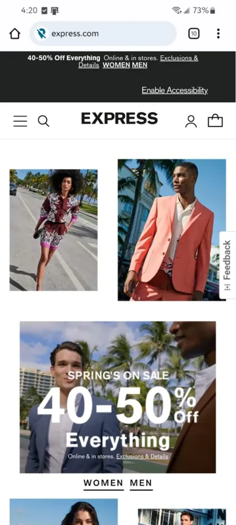
Express.com mobile homepage. Image source: Express.com
This clothing store caters to young men and women — an audience whose time Express respects by making its mobile site highly intuitive. The prominent hamburger menu gives you one- or two-tap access to various departments. Additionally, the well-positioned search bar offers users instant links to trending search terms.
The site’s imagery is sharp and high-quality and the “Style It With” function is helpful, pointing visitors to other clothes and accessories that complement the item they’re viewing. Another nice touch is that users can swipe left on a product image to see a different view of each piece, even if the thumbnails are off-screen.
Takeaway: Shoppers want instant gratification. Everything on the Express mobile website can be done in one or two taps. The recommendation engine is a natural way to promote upsells and cross-sells. Letting shoppers see multiple item views without extra navigation dramatically enhances the UX.
3. Nike
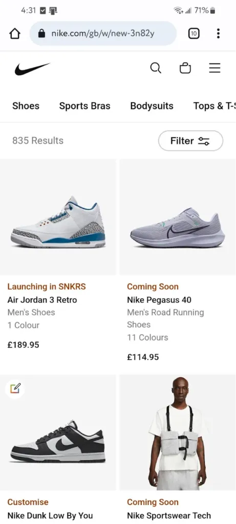
Nike’s new and featured page on mobile. Image source: Nike.com
This well-known shoemaker and retailer relies on stunning product photos and concise copy to engage users. The site’s minimalist design focuses on the products with detailed, high-resolution and fast-loading images.
There are four main icons at the top of the page: a search bar, an account icon, a shopping cart and a hamburger menu to access various categories. Once in the menu, you’re two taps away from getting to the department you want.
Takeaway: Busy shoppers appreciate high-quality images and clear, descriptive copy alongside the products they’re interested in. Without these elements, you risk losing visitors’ attention. Your website competes against text messages, Facebook updates and the lure of Snapchat, Pinterest, TikTok, Instagram, X and LinkedIn. You don’t have much time to grab and keep a shopper’s attention.
4. Threadless

Threadless homepage. Image source: Threadless.com
Like many massive online platforms, organizing your products effectively is key to making them easy for visitors to find. When you arrive on the Threadless homepage, you’re presented with a helpful curated set of collections. If you want to dig deeper, you can find creators via the search bar and use the hamburger menu to access individual departments and their subcategories.
The product pages are attractive and functional. Most products feature a selection of images, allowing the visitor to inspect them more deeply. You can also browse customer feedback before making a purchase decision.
Takeaway: Threadless is a textbook example of how e-commerce providers should use the limited space available on a smartphone screen. Getting around the site is fast, fluid and intuitive. Each page is attractive and well laid out and the site makes it easy to do what you want.
5. Lush

Navigation on the Lush mobile website. Image source: Lush.com
This handmade soap and cosmetics brand presents its products in a clean and appealing grid format with large product images. There’s a prominent “Add to Cart” button under each item, so you can add something to your shopping cart without opening a new page.
This attractive, minimalist site sells the brand well and the UX is a clear priority. The search bar is easy to access and navigating to different parts of the site is easy. Its predictive search feature is excellent, presenting products the site visitor may be interested in.
“Sites like Lush engage users with transparency and creativity, turning shopping into an interactive experience,” Malick explained.
Takeaway: More e-tailers should consider integrating predictive search into their websites. It helps speed up a user’s search process, providing an even better UX. From an e-tailer’s perspective, searches offer another opportunity to promote products by including them prominently in the search results, as Lush does.
6. MyDeal Australia
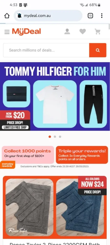
MyDeal smartphone homepage. Image source: MyDeal Australia
This global online retailer, based in Australia, sells everything from electronics to housewares — a kind of Antipodean Amazon. MyDeal’s navigation is as seamless as Amazon’s. One tap takes you to MyDeal’s departments (for example, Electronics), two taps take you to product groupings (TVs & Projectors) and three taps bring you to product types (DVD players).
The website’s product images are high-quality and the fonts are large enough for easy viewing across all devices. The checkout process is straightforward and shipping charges are displayed throughout, not just on the final page.
“[MyDeal Australia] gets it right with reward points, visible offers and the ‘Search millions of deals’ bar on mobile search,” Williams noted. “It instantly grabs attention, simplifies shopping and keeps users returning for more rewards.”
Takeaway: MyDeal’s desktop, mobile and app iterations look great and function well. Real care has been taken to provide the highest levels of functionality and ease of use across all three platforms. The app’s larger font size is helpful for the visually impaired and those who may need reading glasses.
7. Amazon
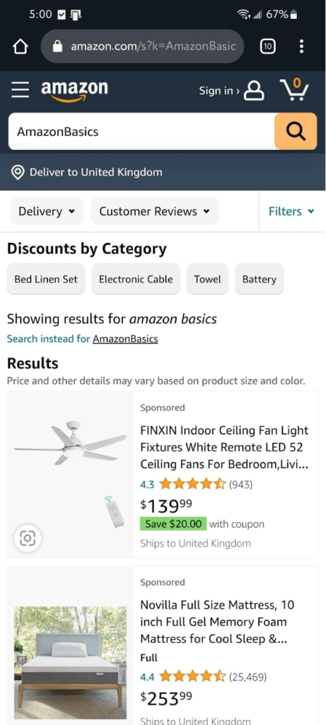
Amazon’s smartphone homepage. Image source: Amazon.com
Amazon’s mobile website looks identical to its mobile app, so it’s very familiar as soon as the page loads. It offers the same ability to search via department or automated suggestions when typing into the search bar. The site is quick and it’s easy to get where you want.
Since its early days, Amazon has obsessively focused on delivering what customers want rather than winning design awards and this is evident on its mobile site.
Takeaway: If you have many products, make your website easy to navigate by allowing shoppers to search by department and category, as Amazon does. Ensure the department links are prominent at the top of the page and are easy to find. Be consistent with your linking structure throughout the website so you don’t confuse shoppers.