

3. Straightforward Navigation
Once you’ve established the purpose of your site and your target audience, your top priority should be improving its user experience (UX) to make it as easy as possible for this audience to get around.
According to research, 79% of website visitors will immediately look for another site if there is a poor user experience. To make sure your audience gets from A to B within this time limit, and without expending too much mental effort, you need to consider your site structure.
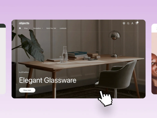
SeatGeek’s search bar invites users to search for events and artists, increasing the amount of time they’ll spend on the site. Source: SeatGeek
A good website example that gets its navigation spot on is SeatGeek. The page displays a search bar, which encourages the user to search the site for whatever team, artist, event, or venue they’re looking for, saving them the time it would have taken to find results manually. Using navigation bars like Seak Geek’s – or on-page menus – will significantly improve your website’s user experience, and pretty much guarantee viewers stay on your page for longer.
By contrast, try canceling your Amazon account. There’s no way to close your account from the My Account section, and even on the Contact Us pages, the process isn’t made clear.
Another shortcut to finessing user experience on your site is using Shneiderman’s eight golden rules of interface design. The guidelines were designed to help designers enhance usability across a range of products, and are especially relevant when it comes to web design. The roles are as follows:
- Strive for consistency – Use the same design patterns, color scheme, terminology, and typography across your website to help viewers familiarize themselves quickly.
- Seek universal usability – Ensure your website is accessible to all users, including those with visual, auditory, and cognitive impairments. This can be achieved by adhering to WCAG (Web Content Accessibility Guidelines).
- Offer informative feedback – Provide visual or auditory feedback when users interact with your site. This reassures users that their activity is being registered.
-
Design dialogs to yield closure – Clearly indicate when the user has completed an action, by displaying a confirmation message, a notification, or other forms of visual feedback.
- Prevent errors – Anticipate that potential errors may take place on your website, and provide users with straightforward ways to recover from them.
- Permit easy reversal of actions – Allow users to undo actions on your website, such as deleting text, removing items from a card, and canceling checkout processes.
- Keep users in control – To make users feel empowered when using your website, give them the autonomy to take actions, make decisions, and undo errors.
- Reduce short-term memory load – Create a simple yet effective interface, and avoid overwhelming the user with complex design and unnecessary information.
Here at Tech.co, we recommend using website builders to create your own website. The best website builders make it easy to create a navigable site structure, with different page categories and subsections.