

Over one-third of the websites on the internet use WordPress, and many of them have the same problem, they’re bloated and slow. This guide will show you how to fully optimize your WordPress site for speed.

WordPress is an excellent CMS but it has a tendency to become slow depending on the theme you choose, the quantity and type of plugins you use, and where you host it. That’s why I’ve spent years trying different themes and plugins, tweaking code, and testing different hosting providers in a quest to crack the code on how to make the fastest WordPress site possible. My efforts were accelerated after Google declared site speed as a ranking factor.
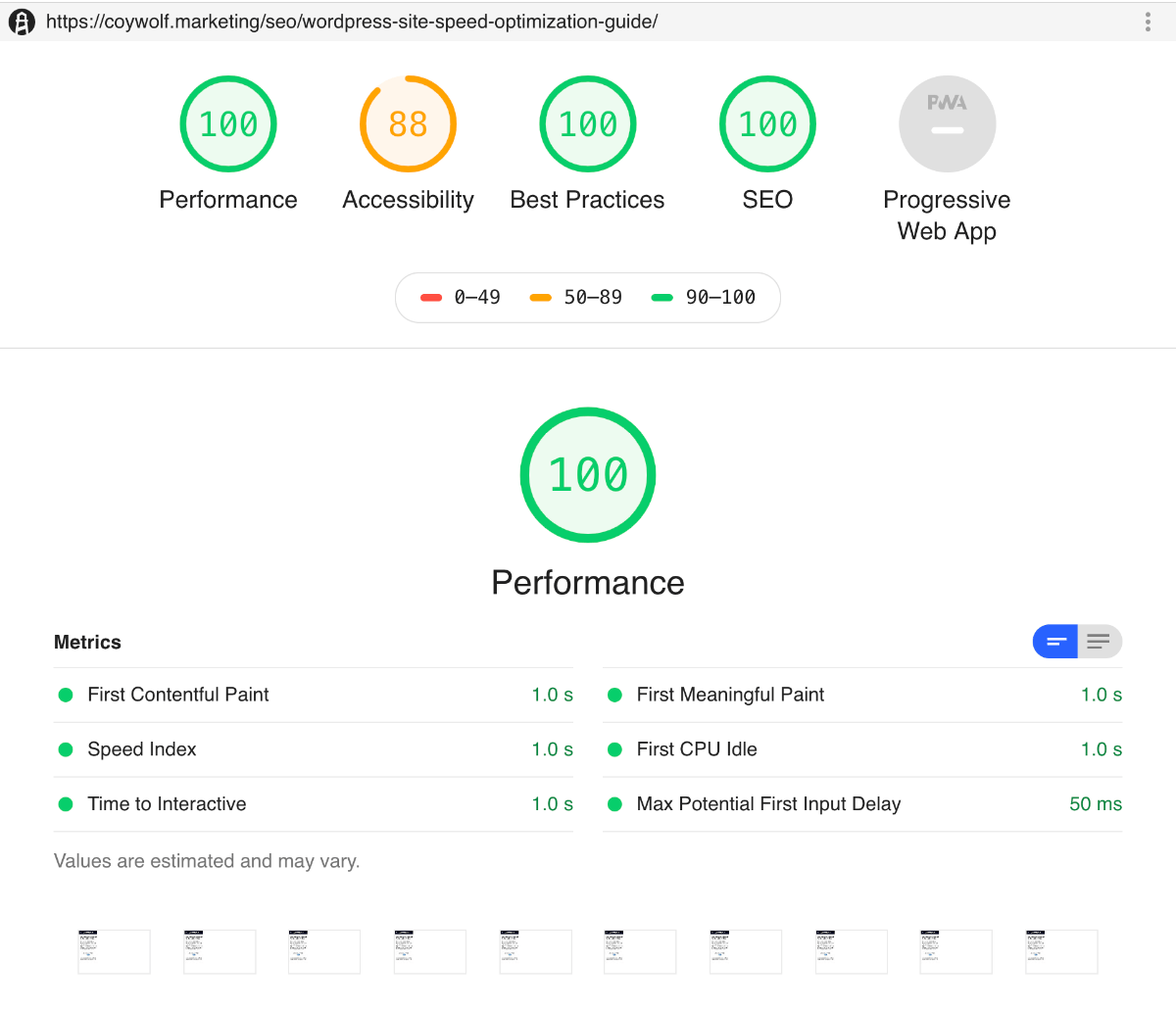
I’m happy to say that I’ve finally found the solution. In fact, you’re currently using the solution. This site is the fastest WordPress site I’ve ever created. Using Lighthouse – Google’s preferred and most modern performance measurement tool – I was able to achieve a First Contentful Paint (FCP), First Meaningful Paint (FMP), Speed Index, and Time to Interactive (TTI) of ~1 seconds on a simulated slow 4G network!
I’ve written this guide to walk you through everything I did to achieve those amazing speed results. My hope is that you’ll be able to use this guide to optimize your own site for speed and further outrank your competitors.
- Choosing the right theme
- CSS optimization
- JavaScript optimization
- Image optimization
- Plugin management
- Adding Schema.org structured data
- Multifaceted caching and content delivery
How to choose the right WordPress theme for speed
Thanks to the popularity of WordPress, there are many pre-built themes that you could choose. If you take your time and carefully research and test out each theme, you will eventually find one that is optimized for SEO, uses modern coding standards, and is highly customizable.
Even though there are good themes available, I have yet to find a non-barebones theme that is capable of achieving near-AMP-level speed. The main reasons are that those themes prioritize functionality, ease-of-use, and customizability before speed. They meet those priorities by requiring code libraries and multiple plugins. That combination comes at the expense of being able to make the site as fast as it could be. That’s why I don’t recommend using non-barebones themes if you want your site to be as fast as possible.
Barebones Themes
A barebones theme – also known as a boilerplate or starter theme – is one that has all of the basic functionality of a typical WordPress site but without the standard plugin requirements, enhanced functionality, GUI-based customization, and pre-set design of a regular theme.
The most popular barebones theme is Underscores. It’s created and maintained by Automattic (the makers of WordPress) and is probably the most robust and flexible barebones theme available. So if you want to make a more complex WordPress site, I recommend using Underscores.
For me, Underscores is not barebones enough. It comes with predetermined includes and template parts structure, and it has more code than I want. That’s why I use the HTML 5 Blank theme instead.
The very first thing I do with the HTML 5 Blank theme is find and remove all references to CSS, JavaScript, and fonts. I also remove block level elements so that all that’s left are the WordPress functions to make the site work. Doing this provides me with a clean palette to work with and removes any chance of having my site load unnecessary code.
A stripped down barebones theme is the absolute best way to build a super fast WordPress site.
How to optimize CSS for speed
CSS tends to get out of control quickly. That’s especially true if a site’s design is complex, gets frequently updated, and is maintained by multiple people. Additionally, most sites have CSS files that load on every page that contains code for every possible layout on the site. They also typically use a CSS framework that includes thousands of lines of code that aren’t even utilized by the site.
CSS code bloat has a direct effect on how quickly a site can load and reach its FMP. To avoid CSS code bloat, I recommend approaching CSS in the following ways.
Avoid or reduce the use of CSS frameworks and libraries
A lot of sites use CSS frameworks like Foundation and Bootstrap because they make it easy to build out a site quickly. They are also designed to work with all major browsers and are compatible with previous versions. These frameworks have thought of just about everything, which is why they require so much code.
In an attempt to get around framework code bloat, they provide minimized versions. Some frameworks, like Foundation, also offer the option to pick and choose which components to download and use. While minimized files and custom framework downloads can help reduce the amount of code used, they still use a lot of code.
This is the point where you have to make an important decision. Do you trade site speed for ease-of-use or do you write your own simpler code and keep your site as fast as possible?
Consider this: If a site’s layout is so complicated that it requires a framework, perhaps the overall design should be reconsidered. A simpler design could reduce the amount of code needed and also improve its UX. Also, modern CSS properties like Grid enable sites to have flexible columns and rows with very little code, while maintaining compatibility with all major browsers.
Coywolf doesn’t use a framework and uses CSS Grid for columns and rows in the header and footer of the site. That’s one of the reasons this site is so fast.
Avoid or reduce the use of linked fonts
All modern browsers now support linking to and using different fonts. In fact, Google made it incredibly easy for web designers to utilize a diverse group of fonts thanks to Google Fonts. These fonts have opened up new style options for designers, but they’ve also slowed down page speeds.
If the font doesn’t exist on the visitor’s computer, the browser has to download it. In most cases, designers will use multiple fonts with multiple weights (thinness and boldness) along with their italicized versions. Font file sizes add up quickly. For example, if you use just one font like Lato, the download size quickly jumps to 1MB.
Linked fonts should be used sparingly or not at all. Instead of using linked fonts, use system fonts. System fonts are fonts that the OS uses throughout its GUI for displaying text. There are several benefits to using system font stacks.
- There’s nothing to download. System fonts render instantly
- They are familiar to the user and look great
- They support a wide range of weights and versions
- You don’t have to worry about the all too common font replacement that happens when a page renders in a browser, and then all of the text abruptly changes to a different font style
The following CSS code covers all major platforms for sans-serif system fonts.
This CSS code covers all major platforms for serif system fonts.
And this CSS code covers all major platforms for mono system fonts.
If you must use non-system fonts, consider using the font display descriptor for @font-face. That tells the browser to continue rendering the page and to display the text, even if it hasn’t downloaded the font yet. There are two font-display options to choose from, swap or optional. The swap option should be used if the font is critical for the UX. Otherwise, optional should be used, which tells the browser it isn’t crucial to the UX and the browser can make the decision to use it or not based on the network speed.
Include render blocking CSS on the page
The first thing a browser processes is the code on the page. If there’s code that’s required for the page to render correctly that’s not on the page, like a CSS file, the browser has to retrieve that file, which can slow down the rendering process. The best way to avoid that is to include all render blocking CSS on the page.
If you have minimal CSS for the entire site because you avoided using a framework, you can skip linking to a CSS file and include all of the CSS code on the page. I recommend keeping all of the CSS in a file and using a PHP include to insert the code into the HEAD area on the header.php file of the theme.
Alternatively, if you still have too much CSS to put on the page, you will want to find and separate all render blocking CSS and put that on the page instead. You can then link to the file with the non-render blocking CSS and defer it by adding the following attributes and values to the link element.
Exclude CSS not used on a page
Another way to reduce the amount of CSS code that’s included when a page is visited is to exclude it. Coywolf uses this technique for the homepage and category pages.
The homepage and category pages use a CSS-based background gradient, and each one has its unique color. It takes several lines of code to make it compatible with all major browsers, and each one of those pages requires its block of CSS to make it work. I used PHP elseif statements to make it only include the code block needed to display the gradient background for the homepage or category page.
How to optimize JavaScript for speed
Some of the same optimizations I mentioned for CSS – avoiding or reducing frameworks and libraries (e.g., JQuery), including render blocking code on the page, and excluding code that’s not used on the page – also apply to JavaScript (JS). For that reason, I won’t bore you by repeating them again in this section. However, there are a couple of things you should consider that are unique to JS.
Load JS asynchronously
For non-render-breaking JS, you can add the async attribute to the link element to allow the browser to return and load it after it’s finished building the DOM.
It’s important to note that browsers tend to load JS as early as possible even when you’re using async. That’s why Ben Morss, Developer Advocate at Google, recommends loading non-critical JS after the load event using a defer script.
An even easier method to identify and defer non-render-breaking JS is to use Cloudflare’s Rocket Loader feature.

Rocket Loader prioritizes your website’s content (text, images, fonts, and more) by deferring the loading of all of your JavaScript until after rendering.
Use Resource Hints
If you have a page that you’re trying to funnel visitors to, like a shopping cart or checkout page, you can use the prefetch Resource Hint to have the browser load large JS files in the background. Then, when the visitor finally navigates to the page, it should load incredibly fast because the JS assets will already be stored in the browser’s cache.
How to optimize images for speed
Images that are large and unoptimized can significantly slow down your site. Fortunately, there are several ways to optimize images for speed.
Use the best format for the image
The ideal image type for web pages is SVG. These vector images have small file sizes and look great on high-definition screens. However, they should only be used for simple images like icons, logos, and images that are not complex. For example, you wouldn’t want to use SVG for a photograph or image with many colors and objects.
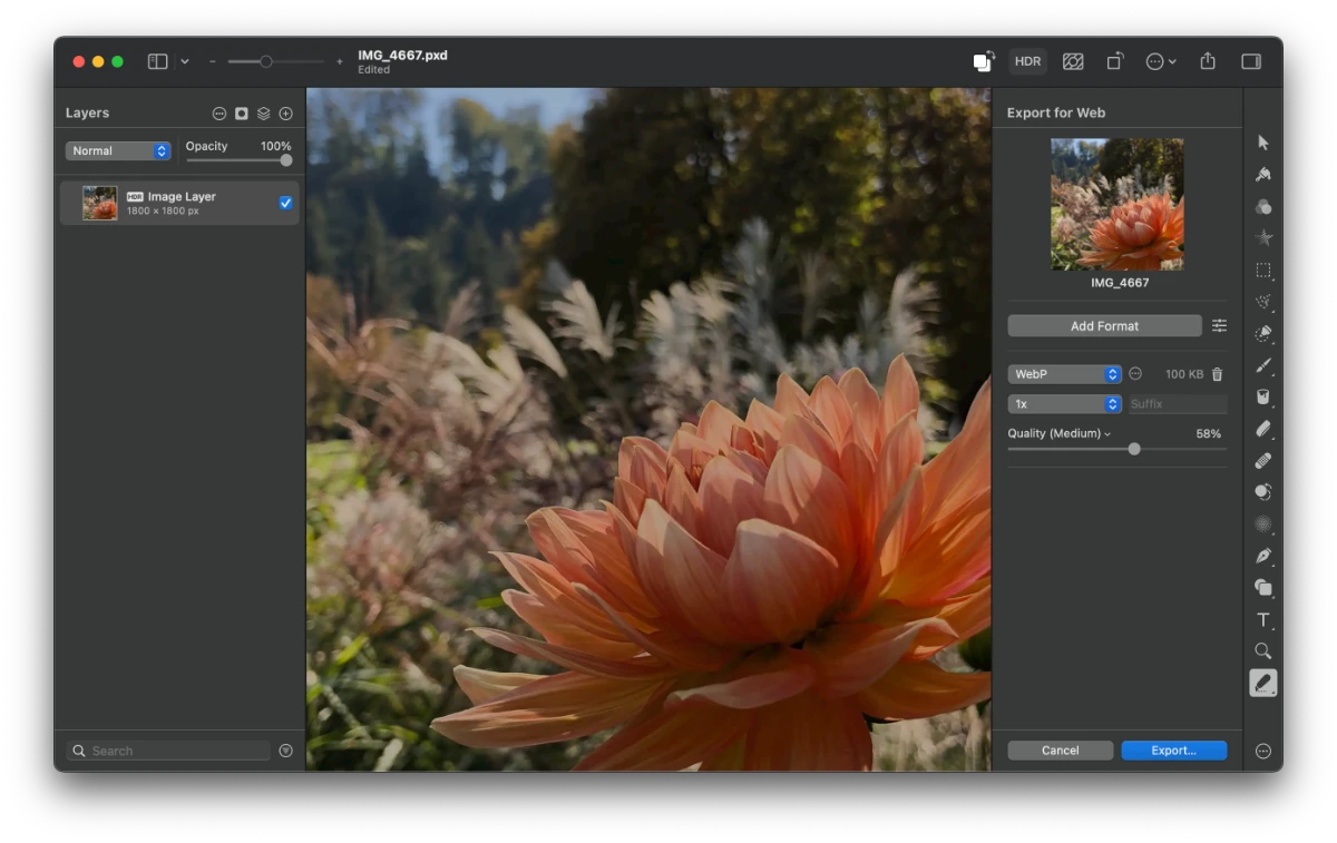
The next ideal image type after SVG is WebP, which is superior to PNG and JPEG in compression quality and is supported by all modern browsers. These raster images work well for simple or complex images like photographs. One of the best features of WebP is that it supports transparent backgrounds and is smaller in file size than PNGs.
| SVG | WebP |
|---|---|
 |
I created this flowchart to help you pick the right image. Here’s a PDF version of it if you want a printer-friendly copy. Also, this flowchart was adapted from Daniel Box’s flow chart which was originally adapted from Ilya Grigorik’s flow chart.
Which image format should you choose?

Reduce the size of WebP images
WebP images can be significantly reduced in size by changing their Quality and using an optimization tool. For example, you can use image editing software like Adobe Photoshop or Pixelmator Pro to export smaller-sized WebP images.
Lazy load images
Another way to speed up pages is to serve and display only images that can be seen in the current browser view (above the fold). That method is called lazy loading, and it forces the browser to download and render images only as the user scrolls down the page. Lazy loading is most helpful on long pages with many images.
Lazy loading used to require JavaScript, but in August 2019, Chrome added support for native lazy loading, and today, all modern browsers support it. With native lazy-loading, web developers only need to include the
loading attribute and specify a value of either lazy or eager.
Alternatively, you can use a single-purpose JavaScript code that supports responsive image attributes like SRCSET. Two popular scripts that do that are:
One thing to consider when using lazy loaded images is that if all images don’t specify a height, it can break the UX for jump links. When you click a jump link, it immediately “jumps” you down the page before lazy-loaded images have been downloaded and displayed. Once displayed, if they don’t have a height, it may shift where you are on the page after the initial jump.
How plugins affect site speed
Every time you install and activate an additional plugin, it increases the chance of your site becoming unstable and slower. There are several reasons for this:
- Some plugins aren’t compatible with each other
- Plugins can add their own custom CSS and JS code that you can’t control
- Plugins can be dependent on code frameworks and libraries and will add links to them on all your pages
- Some plugin developers stop maintaining it, which can result in the plugin breaking in a future WordPress update
For those reasons, it’s important to use as few plugins as possible, and to only use plugins that you know are compatible, maintained on a regular basis, and don’t introduce a lot of new code that’s completely unnecessary.
Coywolf uses a total 5 plugins (6 if you count the Campaign Monitor add-on for Gravity Forms).
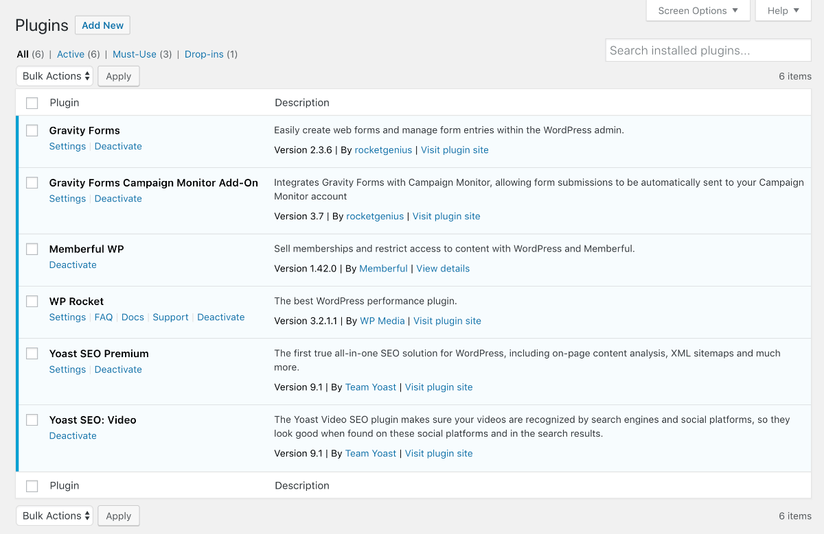
I use the bare essentials of what I need to run the site and nothing else. Everything else gets added to the templates or the functions.php file in the theme. This is one of the main reasons the Coywolf site is so fast.
How to add Schema.org structured data to templates
In an effort to reduce the number of plugins I use on Coywolf, I decided to add Schema markup directly to my theme’s templates. These are the four I added:
- Organization – Added to footer.php
- WebSite – Added to footer.php
- BreadcrumbList – Added to single
- Article – Added to single.php
Adding Organization and WebSite to the footer.php template makes the structured data appear in the source of every single page. Whereas, adding BreadcrumbList and Article to the single.php only includes that structured data on posts.
Since the structured data for posts contains dynamic data, I was able to use WordPress functions to insert the correct data. Here are all the functions I used to dynamically insert the post data into the structured data.
WordPress functions for dynamically inserting data into Article schema markup
WordPress functions for dynamically inserting data into BreadcrumbList schema markup
Multifaceted caching and content delivery
A key component to Coywolf’s incredibly fast site speed is the use of multifaceted caching and content delivery services. These are the two services that make it all possible.
- Pressable WordPress hosting provides
page caching (Batcache, advanced-cache.php, via Memcache), database query caching (WordPress Object Cache, extended by object-cache.php via Memcache), OPCache (PHP Code), and static asset caching (CDN)
. - Cloudflare ensures that your site content is delivered as fast as possible through its caching and speed optimizations, and also provides automated Signed Exchanges (SXG).
Cloudflare configuration
Pressable has a CDN option, but I prefer to use Cloudflare for my CDN because it has so many more options and allows me to serve assets with the same domain.
You can configure your site on Cloudflare using the same settings that Coywolf uses. These settings are organized by section. Keep in mind that some of these settings may only be available to Pro accounts.
- Crypto
- Always Use HTTPS: Yes
- Opportunistic Encryption: On
- Onion Routing: On
- TLS 1.3: Enabled
- Automatic HTTPS Rewrites: On
- Speed
- Auto Minify: Check all options (JavaScript, CSS, and HTML)
- Polish: Lossy and WebP checked
- Brotli: On
- Mirage: On
- Caching
- Browser Cache Expiration: 1 month
- Always Online: On
- Page Rules
- Add Always Use HTTPS rule
Replace domain with your own domain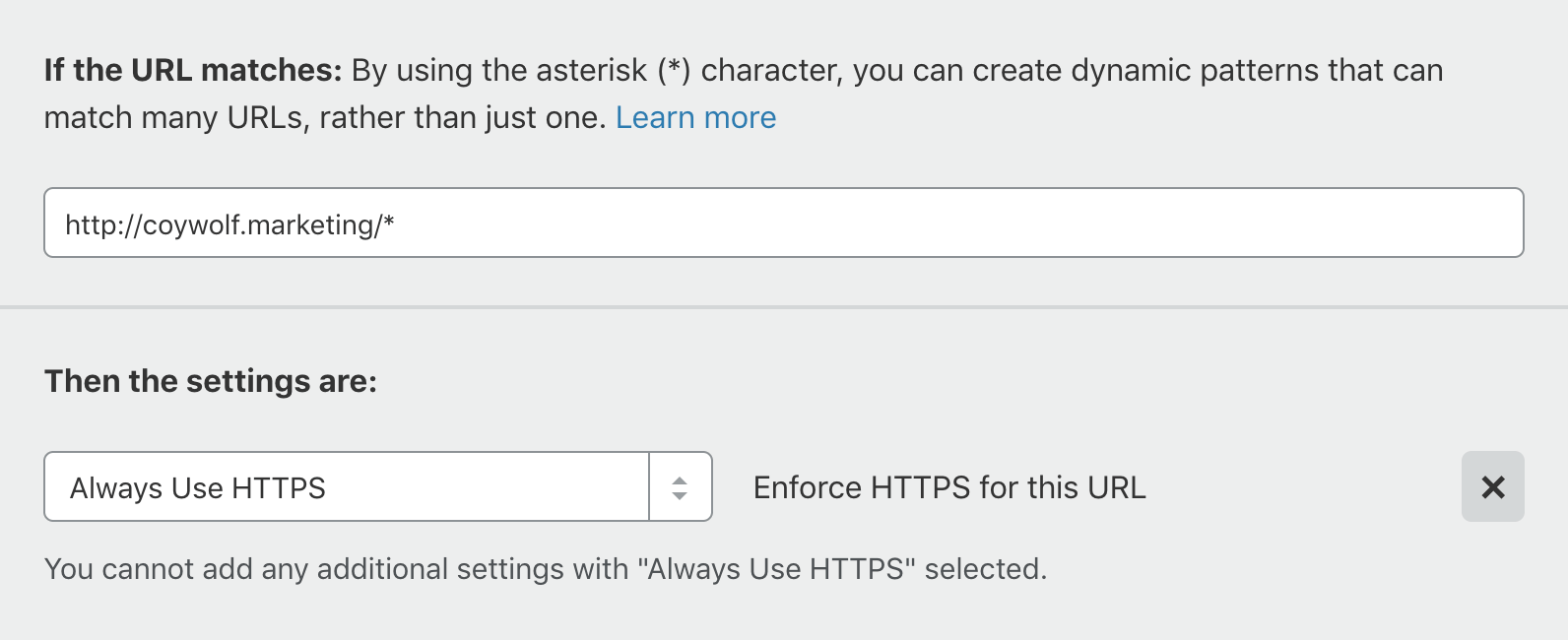
- Add Always Use HTTPS rule
- Network
- HTTP/2: On
- WebSockets: On
- Traffic
That’s it! You’re done. Well, are you ever really done?
Everyone’s site is different so performance will vary. It’s likely you won’t get your site to be as fast as Coywolf is but you might. The important thing is that if you implemented all or most of the items in this guide, you will have fully optimized your site for speed. It should be fast and you should be proud of yourself!
Jon Henshaw is the founder of Coywolf and an industry veteran with almost three decades of SEO, digital marketing, and web technologies experience. Follow @jon@henshaw.social